Boring Content: Why Tech Social Media Fails to Engage (and How to Fix It)


Summary
What really needs to be fixed on tech social media, and what really makes followers excited?
This article explains why most IT, SaaS, and technology feeds feel boring and predictable, the hidden execution pitfalls that ruin even solid strategies, and how to turn a faceless corporate page into an engaging, high-performing channel that people voluntarily choose to follow.
Take a glance through the social feeds of most IT and SaaS vendors, startups, or software houses, and you'll spot a bizarre trend. Companies building genuinely mind-blowing tech consistently manage to post content that is utterly bland and predictable.
The saddest part is that this affliction affects not only small startups with minimal ad budgets, but also market giants with multi-million revenue streams. It’s hard to pinpoint who started this boring habit, or why an industry packed with some of the smartest minds on earth suddenly decided its social channels weren't worth the same effort as its product. But the fact remains: tech companies are overwhelmingly churning out content just to tick a box.
What mistakes do tech companies make, and how can social media be transformed from an abandoned formality into an effective tool for sales or community building? How can you fix your communication strategy, translate a complex technical product into clear, relatable meanings for your audience, and implement systematic content marketing that turns company pages into a source of business value, making users genuinely want to hit "Follow"? In this article, experts from Sasquatch Digital share their expertise and answer all of the questions above.
Part 1. What’s Wrong with Your Tech Feed: 6 Red Flags
Scroll through at least the first 10 random pages of tech companies (we will be focusing our analysis on Instagram, as it is the platform where almost all tech brands are present, and the only one that allows you to evaluate a maximum amount of visual content in a single grid layout) — and you will begin to recognise the exact same six symptoms everywhere. If you spot your own account in even half of these points, we have bad news: you are doing social media wrong.
1. Textual Patchwork Instead of Visuals
Your news feed is filled with charts, dry statistics, and text that no one can read on a smartphone. Instead of creating content for real people scrolling on their phones, it looks like someone copy-pasted slides straight out of an internal annual report.
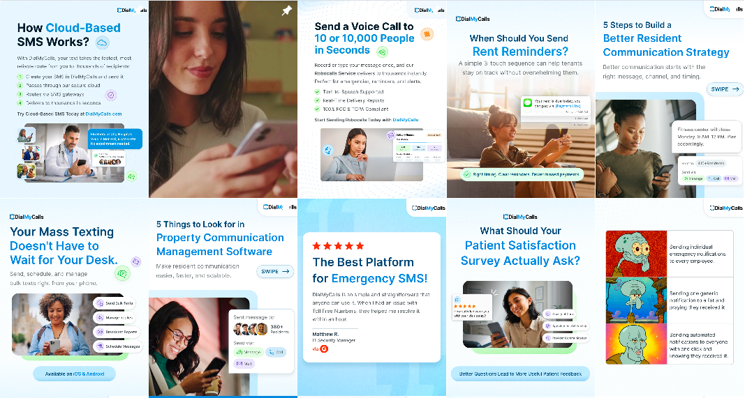
Instead, a great example of SMM communication is the @Readdle company pages and their products — @Documents, @Spark and @Calendars. Despite the fact that the same team works on them, each account has its own character, and the publication site organically combines text blocks, high-quality photos, and graphic elements.
2. Visual Chaos
Scroll through one of these profiles, and the whole feed looks completely random: a mix of different fonts and image sizes, clashing templates, and inconsistent photo quality. Every post looks as if it was designed by a different person on a different day in a completely different mood. The lack of a design system is obvious to the naked eye.
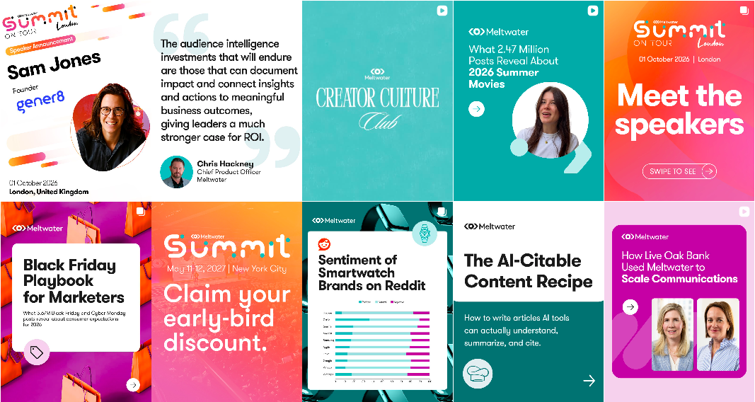
This point is the trickiest trap to stumble into. With decent graphic design, the example provided might actually look acceptable at first glance. However, aside from a roughly similar colour palette, there is no clear content structure or distinct post categories. For comparison, here are examples of accounts that do great without a strict design system, but their visuals look really stylish and convincing: @Eney and @Asana.
3. Stock Content
Pages used to be flooded with identical stock photos of corporate handshakes. Now companies have simply swapped out those old stock photos of handshakes and nameless faces for AI-generated visuals. The technology might be newer, but the underlying approach hasn't shifted one bit.
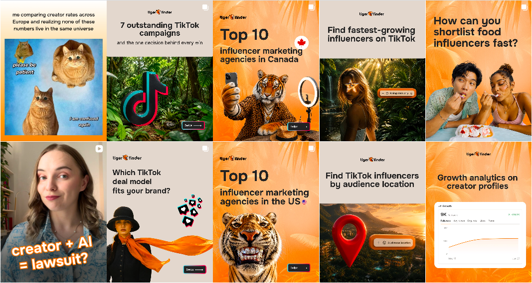
A prime example of AI use is @CleanMyMac , where their communications team successfully integrates real-life photos of employees into generated visuals. Of course, the use of AI content is also justified when a company works directly in the field of AI, such as @Recraft.
4. Zero Employees
Scroll two to five screens down, and you won't see a single real human being who actually works there. The company might employ dozens or hundreds of people, yet the feed looks as though the product is being built entirely by LLM models.
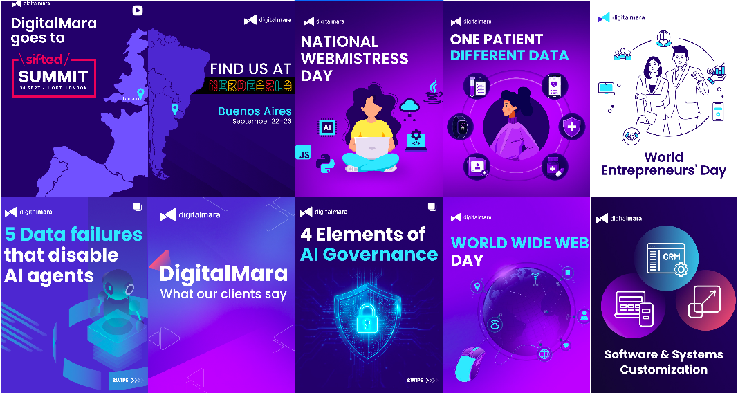
A good example of how to get out of this trap is @Google Gemini: they involve external authors and ambassadors in their content, which adds vivid emotions and emphasizes the scale of the project. The @Moonlock app could also fall into a similar trap — when there is no team in the frame — if it weren’t for their recognizable text layout. By the way, you can also get inspired by really high-quality typographic design on the @Googleventures
5. "Serial" Speakers
The feed feels like a monotonous, repetitive show. It is obvious that the company recorded a single interview with a speaker and sliced it into 20 short Reels. It's always the same person with the exact same background setup. It exhausts the audience by the second video. And even if the outfit changes, the issue of relying on a single speaker remains.

Excellent examples of competent work with speakers are the pages of the company @Datadog and the service @Notion.
6. A Total Lack of Emotion
You won't find any real emotion here, no trending formats, and zero glimpse of actual team life. When memes do appear, they are months late and completely miss the mark. The polar opposite of this approach is accounts crammed with humour that lack a single serious or product-focused post altogether.

Meanwhile, businesses that might be considered boring, like banking, law, or insurance, know how to joke, build communities, and make followers feel emotions.
A great example of social media communication is @Semrush and @Shazam. They organically combine humor with business content, and their accounts look organized and have clearly recognizable elements.
Part 2. Three Content Strategies for Tech Companies
Most tech brands, SaaS startups, and software houses tend to fall into one of three content pillars. They share a similar foundation, but differ in emphasis:
-
Focus on Client Acquisition. Here, the spot is firmly on the product: showcasing what it does, breaking down client case studies, and sharing big company wins.
-
Focus on Team Building. This approach is completely focused on people and culture: interviews with specialists, sharing experiences, showing office life, and publishing reports from corporate events.
-
Demonstrating Leadership Through Expert Content. It’s about analyzing market trends, sharing insightful industry insights, or publishing case studies — without highlighting the team or product.
The problem isn’t the strategy, it’s that its execution is usually ruined by four factors.
Failure Mode #1: Product-Only Content
This happens when only a few people are consistently on the page. While this works well for a small company, the system quickly breaks down as the business grows. Often, this is done deliberately: tech companies are terrified of losing skilled talent. In a market where recruiters are hunting for good specialists every day, giving out the names of your colleagues seems risky. So the management remains in the spotlight, while everyone else remains completely anonymous.
What you get is content built around avoiding risk rather than building connections. And audiences notice immediately when a company is actually trying to talk to them — versus when it’s just trying not to say the wrong thing.
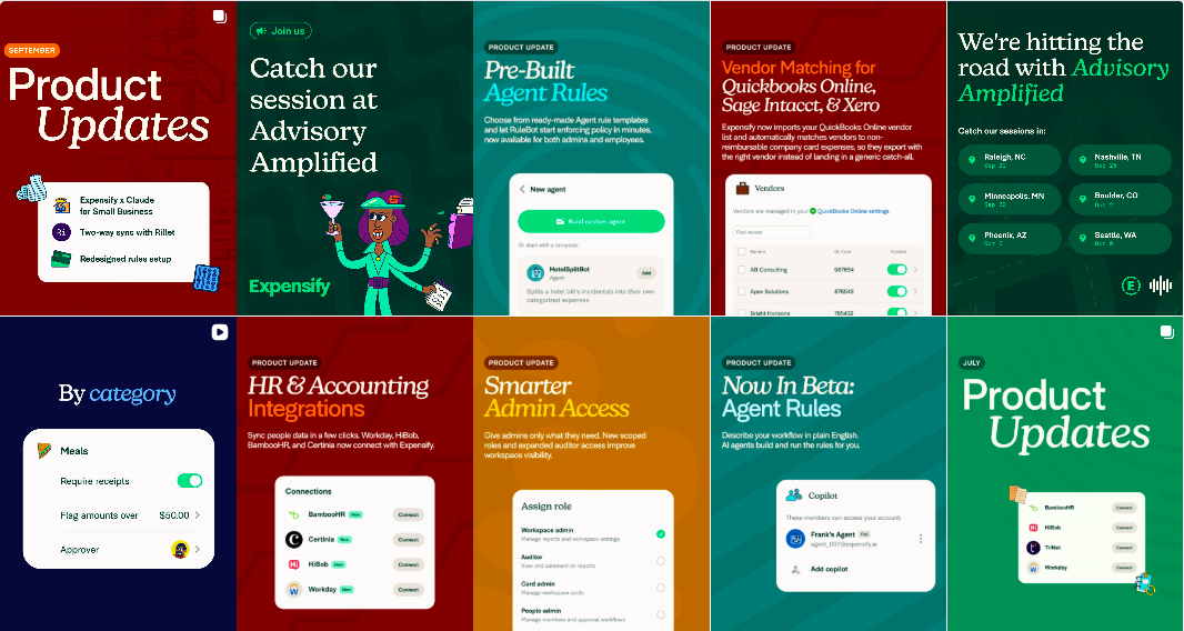
Great examples of successful product-based communication are @Teachable and @Klaviyo. Their content teams showcase their products through a variety of formats, keeping their feed dynamic and engaging for their followers.
Failure Mode #2: The Over-Employer Branding Trap
Here, a company decides that social media equals recruitment, period. The content ends up looking like a personal photo album: office pizza parties, table tennis, and pet photos. The product vanishes completely. When a prospective client lands on the page, they have zero idea what the company actually builds or what problems it exists to solve.

Unlike the above example, companies @SoftServe and @AppLovin successfully place emphasis on their team, harmoniously diluting the photos with branded merchandise, graphics, stylish typography, and general plans.
Failure Mode #3: The Right Idea, Split the Wrong Way
Some companies recognise the gap between HR and product content and try to fix it by splitting them into two separate channels: one for people and culture, another for the product and tech expertise. But pushing employer branding onto a secondary account completely strips the main page of its personality. Instead of building one standout profile that actually connects, you just end up with two dull ones.
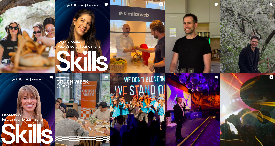
Take Similarweb: they run a main company page alongside a separate employee hub and a dedicated hiring channel.
For a giant like LinkedIn, with more than 18,000 employees, splitting up main product updates and internal culture works well.
Failure Mode #4: "Decent, But Forgettable"
Some accounts are just... fine. Okay photography, strict adherence to brand palette, no obvious flaws — but nothing memorable whatsoever. This is perhaps the most widespread failure mode in the industry because it is invisible: nobody gets fired for "fine", yet nobody shares, saves, or converts from a view to a click either. A purely design-driven shortcoming.
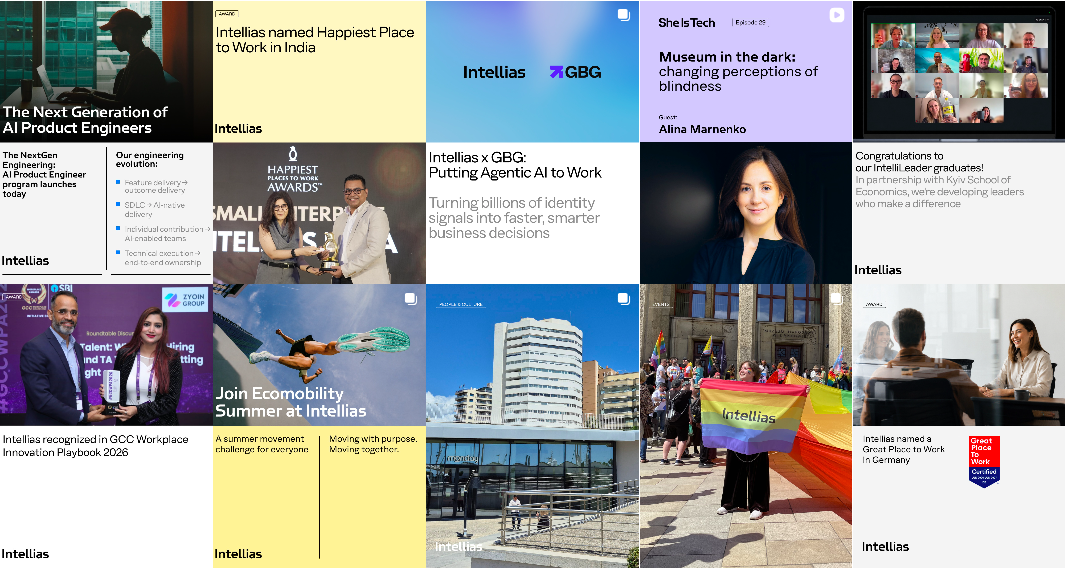
A good example of a memorable page is the @MacPaw account — thanks to the skillful use of corporate colors, fonts and general aesthetics, their specialists easily distinguish the brand from competitors. Another great example can be seen at @Dropbox: the author's photo processing, expressive close-ups and a coherent color scheme favorably distinguish this project in the feed.
Part 3. The Formula for Balance: How to Create Shareable Content
B2B clients want to see that there are real human beings behind the technology — that the company is a capable team with strong values, not a faceless legal entity. At the same time, job seekers want to know what they’ll actually be building and who’s going to be sitting next to them. Both audiences expect high-quality communication.
Correcting errors in the content component is not as difficult as it seems. It requires implementing four fundamental shifts:
1. A Balanced Rubricator
This ties directly back to the three core strategies. Just pick your core content pillars and balance them around what actually drives your business or sets you apart:
-
Product & Expertise.
-
People & Culture.
-
Thought Leadership.
-
Engagement & Reactive Content (industry memes, real-time marketing, humorous takes on professional trends, etc.).
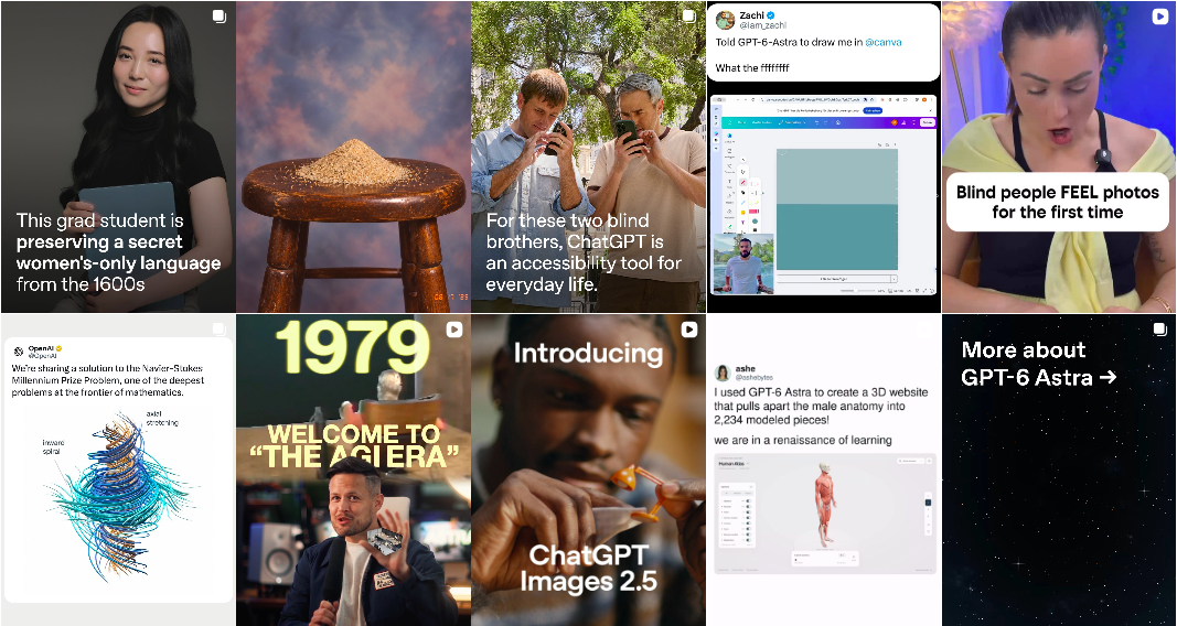
Take @openai’s feed as an example. You immediately see clear visual rules — font grids, consistent typography, and logical publication layout. There’s real thought behind the content feed: similar types of posts are never placed next to each other, the typography is pleasing to the eye, and all the photos are high-quality. In any ten posts, they seamlessly combine product posts and corporate news with case studies and team stories, lighthearted humor, and user-generated content.
2. A Design System Instead of Templates
Develop a versatile social media design system. Forget generic Canva templates — this needs to be a proper set of rules for your fonts, colour palette, photo treatments, and video style. Using a consistent style helps to differentiate different strands of content. The goal is simple: someone should recognize your post in their feed before they see your logo.
3. A Dynamic Production Strategy
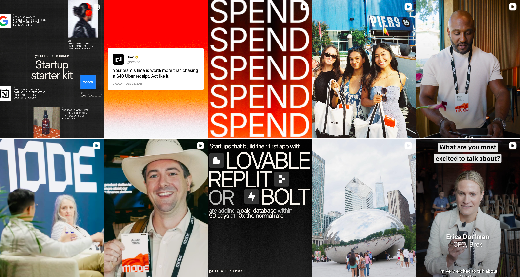
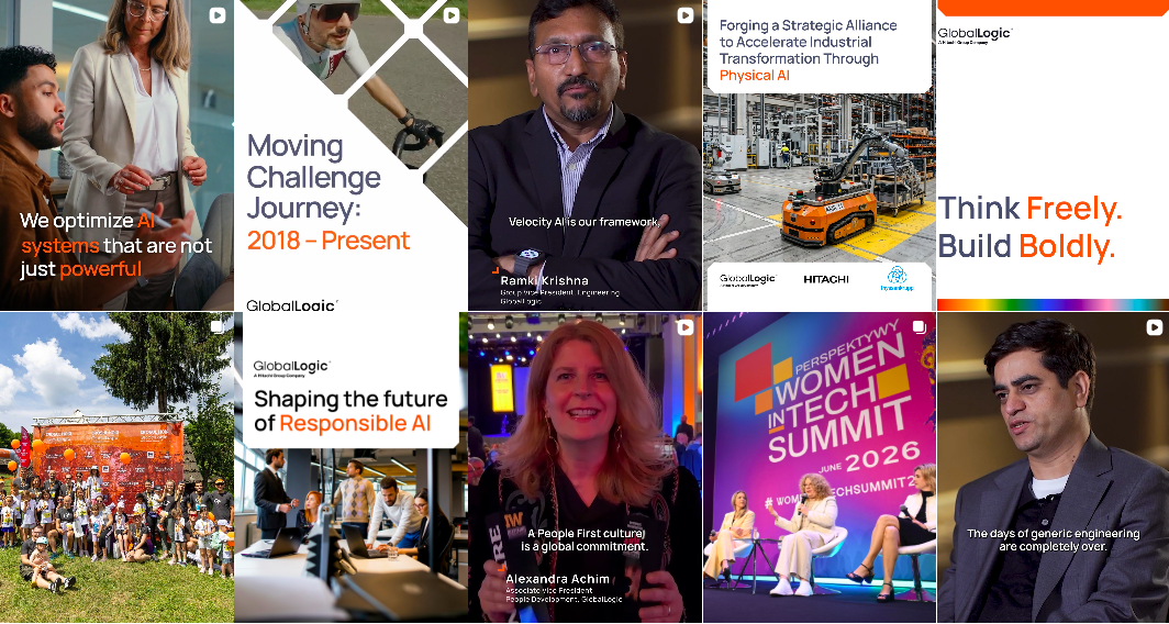
Instead of slicing one long interview into endless snippets, film short, energetic formats. Take advantage of trendy audio, custom sound logos, branded packshots, and unbeatable behind-the-scenes clips. Crucially, make the call to feature your team — reveal the human personality behind the brand and the people building the product. This breathes much-needed emotion into the content.
4. Sharp Humour and Authenticity
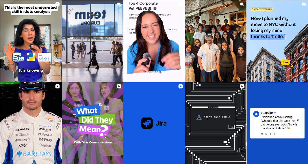
Don't be afraid to be funny. The tech sector runs on niche inside jokes, yet almost no one gets social media humour right. Well-timed humor is the fastest route to virality and high engagement rates (ER).
Checklist: How to Tell If Your Social Media Strategy Is Working
Here’s a simple test: take a close look at your feed and ask yourself this simple question:
“If I were a potential client or someone working in this industry, would I subscribe to this page?”
If the answer is no and your feed still looks like a template from a stock photo library, something is seriously wrong. Stop tweaking your color palette and fix your strategy. In truly effective social networks, the content is engaging and every post conveys value to your business.
Related Questions & Answers
Our content seems a bit formulaic, but we’re fine with that. Does that mean there’s really no problem?
How much damage can boring social media do to a business?
So all we need is a good category manager and a visual makeover to streamline our social media?
How much will following this advice actually improve our bottom line?
With over 30 years of advertising experience, including roles as Marketing Director, Roman is a long-standing jury member for top industry awards such as Effie, X-RAY Marketing Awards, DGTL STAR MRTH, Web Awards UA, and IAB MIXX Awards.
Discover more TechBehemoths Insights
Learn practical tips and insights about IT Companies, how to find the right company for your projects.
Read the latest news about Market Trends and fresh Interviews.