App Performance vs. Perceived Quality: What Users Actually Notice


Summary
- Pinterest tracked how fast its site felt as a metric of its own, and a 40% drop in wait time came with 15% more sign-ups and 15% more search traffic.
- The response time limits designers still rely on come from how people perceive waiting, which is why an app can pass every technical benchmark and still feel slow.
- Onboarding and small confirmations, like a payment that went through or a file that saved, shape trust more than most founders expect, and a generic AI-built interface on a weak architecture wears that trust down quickly.
To begin with, let's set something clear: how an app performs is different from how an app's quality is perceived. An app that is more technical can still feel cheap, as an app that has a “premium” approach can still feel slow. Of course founders and engineers will have a more delicate way to judge products, and it’s important to listen to other opinions; however, the most important factor is, what do your users actually notice?
What Engineers Mean by Performance vs. What Users Actually Feel
Let's dive into the common but indispensable metrics the majority of products will be tested upon:
-
Load time: How much time does an app take to load everything behind the scenes, commonly measured in seconds from the moment a user taps a button until every image, text box, and overall feature is ready to use.
-
API Response Time: How long does it take for an app’s server to respond to a request. You can compare it to how long it takes in a restaurant for the kitchen to prepare your food once they receive the order.
-
Frame Rate: How many images your screen displays per second. The standard is 60–120 FPS; at that range, images are perceived smoothly.
Those metrics are measured through specific patterns, and if they do start failing, the outcome and perception will be evidently close to chaos. From a user's perspective, chaos translates to impatience, so any step or feature that feels “laggy” or “cheap” will be an immediate frustration, even though it’s just a simple issue that can be fixed with a reboot.
|
What Happened |
What it Cost You |
|---|---|
|
App loads a little slower than expected |
Users start doubting it's working |
|
App takes too long to load |
Users give up and leave |
|
Nothing on screen shows it's working |
Users assume it's broken and back out |
The lesson here is that an app can have a perfect load time, API response time, and excellent frame rate, and a user can still perceive it as cheap. Perception for users is built on trust and everyday experience, not the specs running quietly behind the screen, which are critical for it to work, but you can't go easy on the 'trust metric.
The Small Signals that Read as Quality
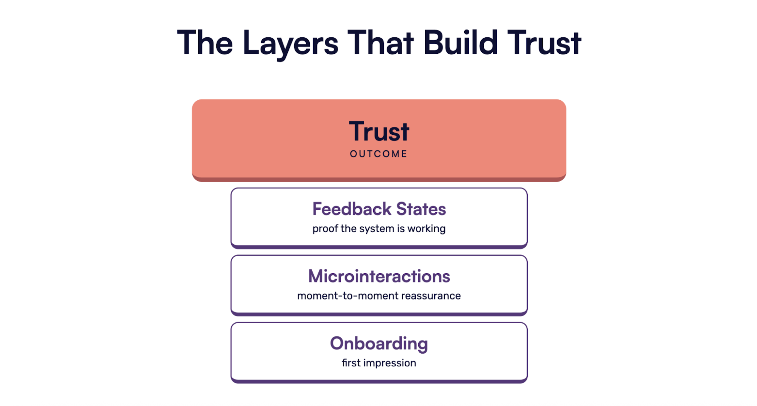
First impressions do matter, even more when you are looking for a potential client to become a steady user; that's why everything begins with the smoothness of your onboarding process. Even a lightweight onboarding still needs to earn trust fast, and that applies to any product trying to get users past the trial phase. The ideal scenario here is creating momentum, giving users the best outcome as fast as possible. For example, a founder might think a few extra steps will help users understand the product better, just to be safe, but those same steps can start to feel like busywork, and that’s often where the user checks out.
The same principle applies for microinteractions; these small signals need to work flawlessly to create a constant positive loop around the daily app experience. Subtle interactions such as a button state changing on click, a confirm message after a submission, or a smooth transition that signals the system is working properly. Microinteractions are all about reassurance for the user experience, which is something important because it feeds momentum and confidence. A user who knows if their payment went through or if the file was saved is a user who will certainly come back.
Ensuring a constant positive loop for the user will always be a quality indicator and will help keep users loyal. A frozen black screen versus a skeleton screen is another great example; it’s a direct visual contrast that readers can picture immediately, keeping the attention loop running instead of letting it break at the exact moment a user could lose interest.
The Real Risk of an "AI-Powered" Approach
Building software with AI tools can be an amazing resource; however, when hype overruns judgment, vibe-coded products tend to fall into the same monotonous category. Where the AI-generated UI gets easily identified:
-
Similar layout patterns
-
Same component choices
-
Identical visual aspects across hundreds of products
This issue might sound insignificant; however, when you analyze this scenario from a broader perspective, you will understand the rise of vibe-coded products means users now have more options and less patience. So believing a product that looks identically to many others will magically translate to user retention is an unrealistic bet. UI design is one of those areas where identity is needed, a visual glance that can speak to the user from an aesthetic and functional perspective.
Besides the UI, another critical issue that can definitely damage the users' perceived quality is when founders lean on AI tools to build an app blindly without contemplating a good architectural foundation. Dealing with a broken product or basic feature requests once the vibe-coded foundation hits its scalability limit can have very negative consequences.
The best use of "AI-powered" is through measured intention, such as creating a demo and validating features. What you should stay away from is using it as a label that "optimizes" your marketing strategy
Case Study: Pinterest
Pinterest launched officially in 2010 with the purpose of becoming the best visual bookmarking tool and popular platform around the world. Between 2015 and 2016, they decided to take on a full rebuild of their web app to cut page weight and restructure how data loaded. Strategically, they decided to track “perceived wait time” as a unique metric, which measured how fast the site felt to the person using it.
As a lesson to founders, Pinterest rated and measured the sensation of speed as a deliverable in its own right. Not a usual way to do it, but, it is effective because of a 40 percent drop in perceived wait time, which translated to a 15 percent increase in sign-up and a 15 percent increase in search traffic. For Pinterest, leaning on vanity metrics won’t create optimization; true value and change come from user behavior that provides tangible answers.
Conclusion
Creating a strategy to enhance your app’s performance is possible; begin by applying user testing methods that surface perception and can help you identify a unique perspective towards a positive quality outcome. That includes using analytical tools to gain data and keep iterating through a well-structured hypothesis-driven development process like the one we apply at Designli.
Achieving a good app performance comes from building a product with a great architectural foundation and building a roadmap that precisely covers what to get from each stage until the app can hold up a good amount of users. But for clients to perceive your app as a product of good quality, you have to earn their trust and reassurance constantly, making their lives easier thanks to your app.
Related Questions & Answers
Does a faster app always mean a better user experience?
Why do small details like loading animations and button feedback matter?
Does labeling a feature "AI-powered" actually build user trust?
Keith Shields is the CEO and Co-founder of Designli, a leading software and web development company. Keith is passionate about creating impactful digital experiences for non-technical founders. He co-founded Applits, a startup recognized as the "Coolest College Startup of 2014" by Inc.com, and has since led hundreds of successful projects at designli.co. As a serial entrepreneur, Keith is committed to helping non-technical founders launch transformative digital products through Designli’s proprietary SolutionLab process.
Discover more TechBehemoths Insights
Learn practical tips and insights about IT Companies, how to find the right company for your projects.
Read the latest news about Market Trends and fresh Interviews.