Why Your Website Doesn't Convert and How UX Design Fixes It


Summary
Most websites lose 95% of their visitors without a single click. Poor UX design is almost always the reason, and most business owners don't even know where the problem is.
This article breaks down the 7 most common conversion killers, from weak CTAs to slow load times, with practical fixes for each. Small changes in design and structure can impact how many visitors actually become customers. If your website isn't performing the way you'd like, the answer is probably closer than you think.
On average, websites convert only 2–3% of visitors. This means that about 95% of visitors land on the site, browse for a few seconds, and then leave without taking any action. Business owners express this as one of their most common frustrations.
So, how can this problem be addressed?
The answer: Make it easy for visitors to take desired actions on your website, such as placing a request, completing a purchase, or filling out a contact form.
Your website should communicate effectively, guide users, and convince.
In this article, we will explore the most common barriers to conversion and how smart UX design can be a solution to each of them.
7 Reasons Your Website Doesn’t Convert
And How to Fix Each One
If your website isn’t converting, chances are one (or more) of these issues is the reason:
- unclear value proposition
- too many choices
- weak CTAs
- confusing navigation
- no trust signals
- too much friction
- slow load times.
#1 The First 5 Seconds Are Everything
When a user visits your website, they quickly decide in under five seconds if it looks trustworthy, relevant, and if they know what to do next. If any of these answers are unclear, they will leave.
The Problem
Most websites fail this test, displaying company information up front instead of the value they bring to visitors. Headings like” Welcome to Our Company,” or “We've been in business since 2005” communicate nothing useful to a first-time visitor.
The UX Fix
Start with a clear value proposition that shows the benefits and answers these three questions right away:
- What do you do?
- Who is it for?
- What's the main benefit?
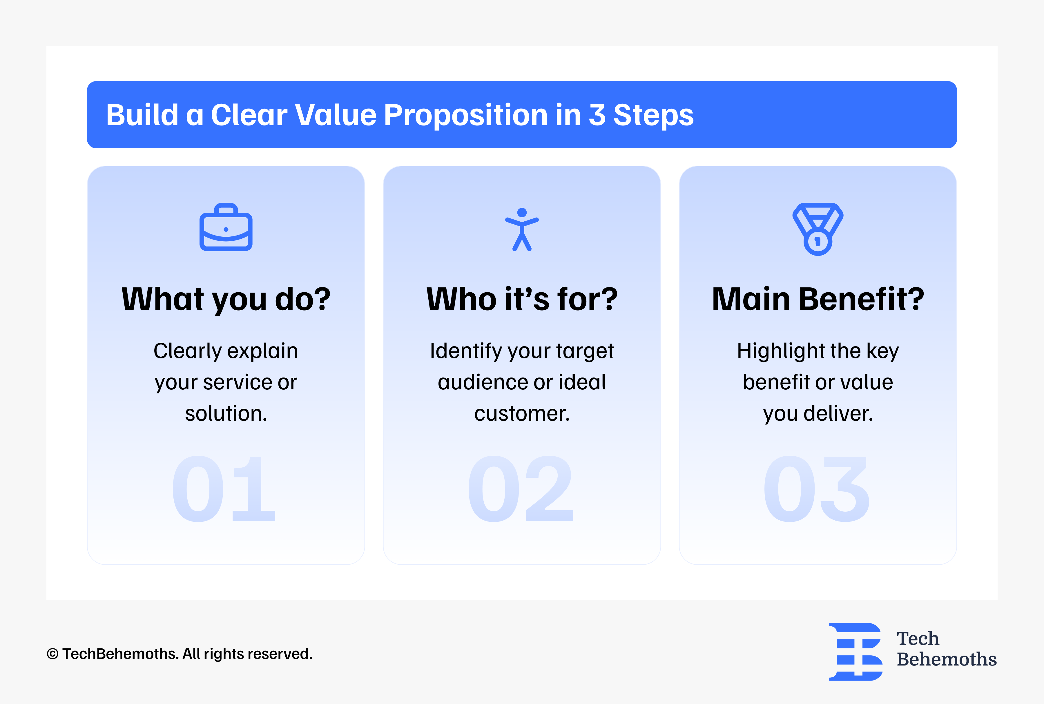
Real Example: Mobiteam, one of the companies featured on TechBehemoths, shared a case involving a Berlin-based tour operator. After replacing a company-focused homepage message with a clear customer-focused value proposition, the website's bounce rate dropped by 31% in the first month.
#2. Weak or Missing Calls to Action
A call to action (CTA) is the bridge between a visitor's interest and your conversion goal. Most websites either have too many competing CTAs or CTAs that are too vague to motivate action.
The Problem
Phrases like “Learn more” or “Click here” don’t help convert visitors into customers. They don’t create a sense of value or urgency. Pages that offer too many different actions at once don’t convert equally. The user ends up choosing none.
The UX Fix
Each page should have one primary CTA, and it should be:
- Specific about the outcome: Get a Free Quote in 24 Hours beats Contact Us.
- Visually prominent: contrasting color, above the fold, repeated further down the page
- Low friction: Don't ask for more information than you need
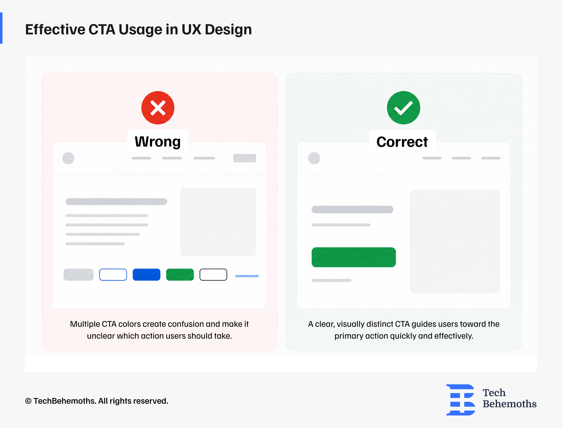
Secondary CTAs (e.g., See Our Portfolio) should be visually subordinate, outlined, or text-based, so they don't compete with the primary action.
#3. Poor Mobile Experience
As of 2025, over 60% of global web traffic comes from mobile devices. However, many websites are still designed mainly for desktops, with mobile views being an afterthought.
The Problem
On mobile, small buttons, text that needs zooming, lengthy forms, and slow load times all hurt conversion rates. If visitors find it hard to use your site on their phones, they'll find a competitor who makes it easier.
The UX Fix
Mobile-first UX design means designing the mobile experience before the desktop one. Key principles:
- Touch targets (buttons, links) should be at least 44x44 pixels
- Forms should use native mobile inputs (date pickers, number pads)
- Content hierarchy should simplify on smaller screens, hide what isn't essential
- Mobile page speed is important. Compress images, minimize scripts!
Real Example: According to a case shared by Mobiteam on TechBehemoths, a Berlin-based online marketplace for used smartphones improved its mobile shopping experience by redesigning its product listing flow with a mobile-first approach. Following the launch, mobile add-to-cart rates increased by 40%.
#4. Lack of Trust Elements
Conversion relies fundamentally on trust. Before a visitor submits a form, makes a purchase, or picks up the phone, they need to believe that you are credible, legitimate, and worth their time.
The Problem
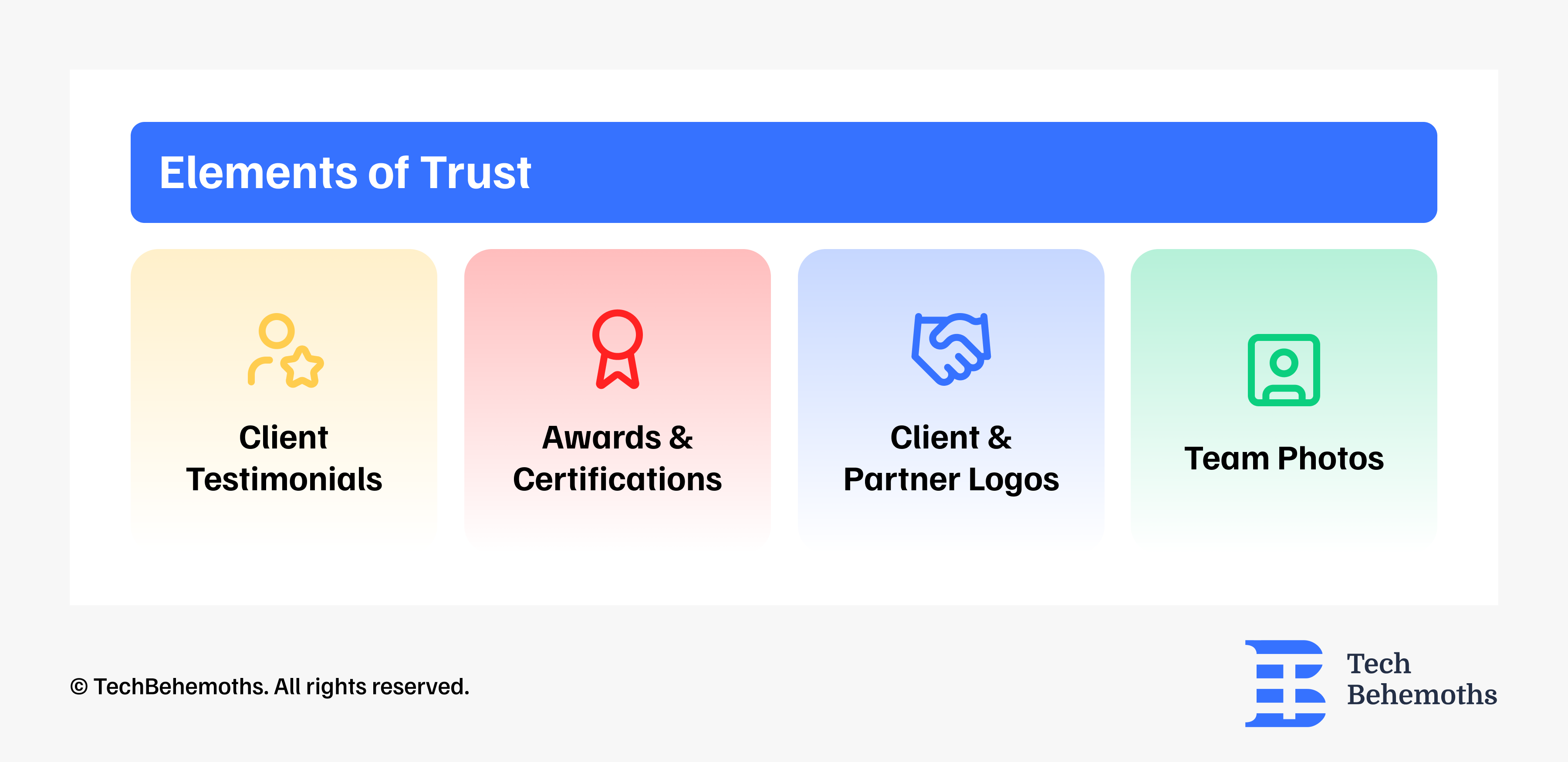
Many websites, especially small and medium businesses (SMBs), do not invest enough in trust-building features. A site with no reviews, no client logos, no team photos, and no certifications feels anonymous, and anonymous businesses don't get inquiries.
The UX Fix
Strategically place trust signals throughout the conversion path:
- Client testimonials with real names, companies, and ideally, photos
- Letters of recommendations
- Logos of recognizable clients or partners
- Awards, certifications, or media mentions
- Real team photos (not stock imagery)
- Case studies with specific, measurable outcomes
These should not only be on an 'About' page. They should also appear next to your calls to action (CTAs), where people have the most doubts and need reassurance.
#5. Confusing Navigation and Information Architecture
Poor navigation is one of the most silent conversion killers, because users rarely complain about it: they simply disappear. Visitors don't read websites. They scan them. And if they can't quickly find what they're looking for, they leave.
The Problem
Overcrowded navigation menus, unclear page labels (e.g., “Solutions” instead of “Services”), and hidden contact information create friction.
The UX Fix
The more choices you present, the longer it takes to decide. Simplify your navigation:
- Limit top-level menu items to 5-7
- Use plain language: "Services", "Job", "Contact" instead of vague labels.
- Make contact options visible on every page, especially in the header
- Use visual hierarchy to guide the eye, because not everything can be equally important
#6. Slow Load Times
Google research shows that as page load time increases from 1 to 3 seconds, the probability of a bounce increases by 32%. From 1 to 5 seconds, it jumps to 90%.
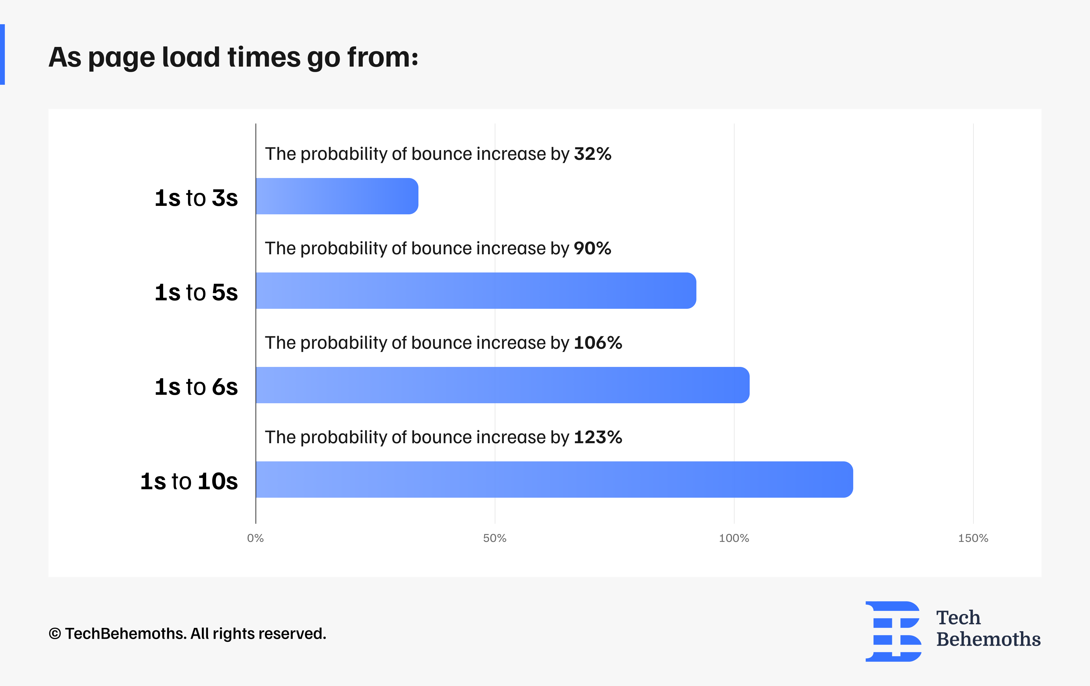
Source: Google/Soasta Research
The Problem
Oversized images, unoptimized code, too many third-party scripts, and cheap hosting slow down your site. And a slow site doesn't just frustrate users, it actively ranks lower in Google search results.
The UX Fix
Performance is an important part of user experience (UX). To improve user experience and website speed, follow these optimizations:
- Use modern image formats like WebP
- Compress images before serving them
- Implement lazy loading for images and content at the bottom of the page
- Minify your JavaScript and CSS by removing unused code
- Choose a reliable hosting service that has fast server response times
- Regularly check your website with Google PageSpeed Insights
# 7. Forms That Ask Too Much
The form itself is a critical UX touchpoint. A poorly designed form is the last friction point before a conversion. Many businesses lose leads at exactly this point.
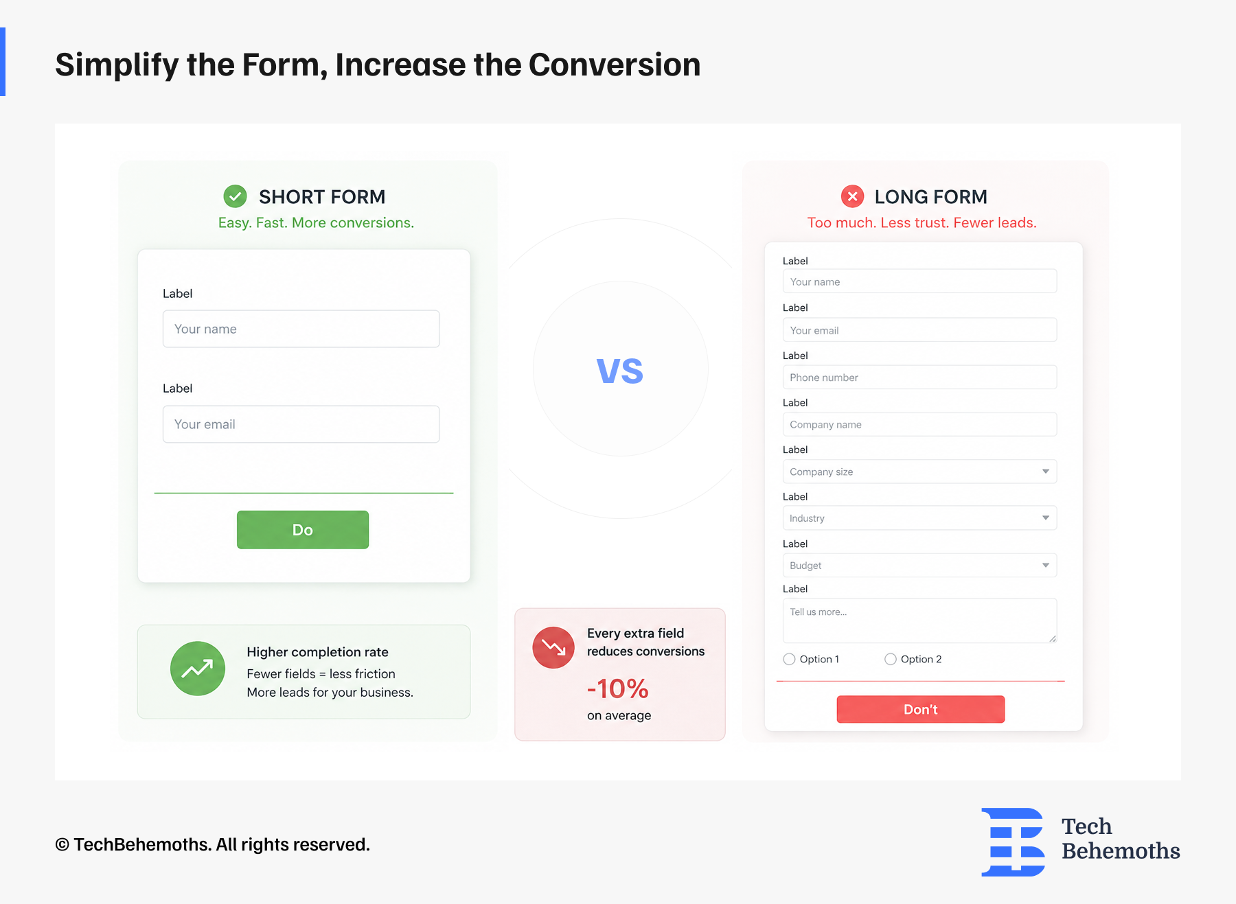
The Problem
Forms that ask for too much information (company size, industry, phone AND email, message, budget…) feel like an interrogation. Each additional field reduces completion rates. Studies suggest every extra field reduces conversions by around 10%.
The UX Fix
Start with the minimum viable form: name, email, and one open field. Ideally, 3-5 questions.
You can always gather more information after the first contact is established.
Optimize your forms:
- Autofill where possible (browser autofill, phone format detection)
- Use inline validation so users know immediately if they've made an error
- Break up long forms into multi-step flows. These seem easier, even with the same number of fields.
It’s important to remember that none of these elements work in isolation. It’s just that when we put them all together, user experience is no longer just about design, but becomes a conversion system from the first touchpoint to the final form submission.
Final Thoughts
If you read through this list and recognize your own website in more than two or three points, all you need to do is correct them. Every one of these problems is fixable, and the results can be significant.
Your website should look good because it is a presentation tool. But more importantly, it is a decision-making environment. And UX is what makes that environment feel easy or impossible.
If you're considering improving your website's performance, working with an experienced UX/UI design team can help identify conversion barriers and create a smoother user experience.
Looking for UX/UI Design Services?
Check our list of top UX/UI design companies on TechBehemoths
I absolutely love embracing new opportunities and connecting with people. Every project is a chance to analyze, create, and work until I am satisfied with the results. Bringing creativity into every aspect of my work offers a fresh perspective on turning ideas into reality. Paying attention to the details is key because it's the little things that truly make all the difference.
Discover more TechBehemoths Insights
Learn practical tips and insights about IT Companies, how to find the right company for your projects.
Read the latest news about Market Trends and fresh Interviews.