Strategic UX/UI Design for SaaS Products


How a UX-Centered SaaS Redesign Saved Intrado’s Most Lucrative Relationship
Software as a service (SaaS) products have some of the most intricate digital experiences — and for good reason.
On a typical website, the interface design is merely the spice that brings an existing brand to life. With SaaS, the interface isn’t just part of the experience; it IS the experience.
SaaS systems are cloud-based, allowing users to subscribe to a service instead of purchasing it once. These products are all about convenience, so an intuitive and engaging experience is the primary expectation.
If a design doesn’t deliver on that unspoken promise, it puts the company in danger. I’ve seen the effects of poor SaaS UX first-hand through my work with Intrado — but with help from my design experts at CreateApe, I’ve also seen the significant impact of strategic UX design in shaping their recovery and ongoing success.
Understanding The Nuances Of SaaS
You may or may not be familiar with the term SaaS, but you’ve most certainly used one of these products before.
Whenever someone mentions software, you might think about super-advanced tech systems that process data and code. While plenty of SaaS products do exactly that, many serve practical and recreational purposes in our daily lives.
From integration tools and chatbots to project management and graphic design, millions of users rely on SaaS systems to streamline workflows, oversee employee and customer relations, and create stunning visuals for their websites and social media profiles.
Because these complex systems are accessible through a web browser and maintained by third-party providers, SaaS products are a budget-friendly option for businesses and freelancers — splitting payments yearly or monthly to avoid a big one-time purchase.
This web-based approach also makes your chosen systems accessible across devices, enabling you to take your work on the go and stay in the loop when you’re out of the office. Plus, system updates are automatically included, (almost) eliminating the need for subsequent purchases and installations.
The Importance Of Strategic UX/UI Design For SaaS Products
SaaS products have changed how we handle everything from business to hobbies through convenience and accessibility. With a wide range of products catering to diverse users and innovative features, this rapidly evolving niche of products has major potential as technology advances.
Unfortunately, great ideas for a digital service don’t always guarantee a great product. Complex navigation, poor data translation and visualization, lack of training, and ambiguous visuals can leave potential users feeling more confused and frustrated than before.
Like with any digital product (website, app, e-book, etc.), an inventive, but legible design is a key factor in usability and customer retention. To put it simply, what good is a “convenient” product if your target audience can’t figure it out?
To curb the threat of disappointing user experiences and save brands from a negative reputation, companies should rely on a strategic UX/UI research and design process every time they release a new product or feature. This usually entails:
-
User-Focused: SaaS systems are intended to be used by diverse personas within a defined audience. This means that anyone from tech-savvy users to those with limited capabilities needs to comprehend task completion flows and feature operation.
-
Engagement-Optimized: Because of the subscription-based model, SaaS products generate ongoing revenue. However, if users aren’t satisfied with a new variation, you’ll see an uptick in abandonment rates and revenue loss.
-
Efficient Workflows: Users rely on SaaS products to simplify complex tasks and supercharge their productivity. Always thoroughly test each user journey with the target audience to rectify pain points before the fact.
-
Onboarding & Training: There’s always a learning curve when it comes to using a new product. But with a well-designed onboarding process, you can guide users through task completion and show them where to find relevant features and portals — cutting adjustment time in half.
-
Scalability: Adaptation is the name of the game. Users seek out SaaS products to grow their business and attract new customers, so they need some reassurance that the system can accommodate new profiles and use cases.
-
Data-Driven: The actual design of a SaaS system can make or break the experience. Companies should always rely on testing and user feedback before implementing a design change or a new user flow.
Intrado: The Real Impact Of UX in SaaS
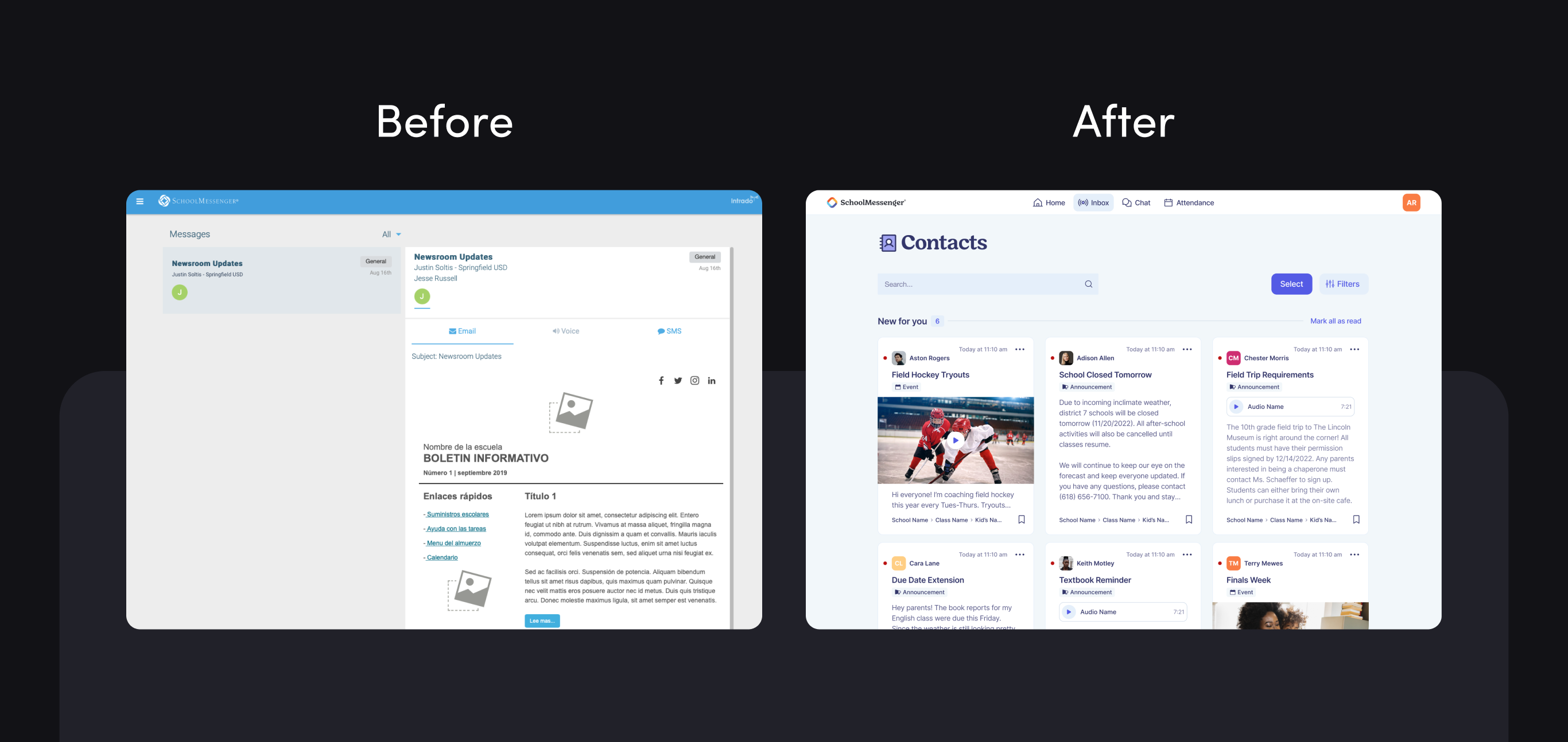
Intrado, a renowned telecommunications company specializing in emergency technology solutions, owned the SchoolMessenger app. This SaaS system was designed to keep parents, teachers, and school administrators in touch throughout the academic year.
As you can imagine, the SchoolMessenger app had several moving parts that needed to cater to various personas. A straightforward navigation and uncomplicated experience was an absolute must to suit busy educators and parents on the go.
However, the app was bogged down by severe UX issues that were stopping sessions — leading to an exponential growth in churn rates and numerous complaints from their clients.
Though the SchoolMessenger app was used by 55% of the schools in the USA and 65% in Canada, the developer-designed interface hadn’t been updated in 20 years.
The extremely outdated design and code, coupled with the lack of navigational guidance, confusing onboarding process, disorganized content hierarchy, and unclear messaging flows put Intrado at risk of losing one of the largest school systems in their network.
To repair their relationship with their most lucrative client and foster more intuitive experiences at the ground level, they needed a second opinion (fast)!
CreateApe’s Strategic UX/UI Intervention
Intrado previously partnered with a competing UX firm to update SchoolMessenger’s design, but they were unsatisfied with the results. Since this competitor was one of the largest firms in the country with significantly more resources at their disposal (name withheld for professional purposes), CreateApe entered the arena with something to prove.
We began with a robust evaluation of the app in its troublesome iteration and pinpointed issues with the user experience. We examined each app flow and identified barriers complicating two-way and group messaging.
On top of evaluating the chat flows, we wanted to simplify the app navigation and onboarding process. Since this was the first user touchpoint, we wanted to ensure that teacher training and student registration were as smooth as possible.
We demonstrated which flows needed design tweaks or complete overhauls to facilitate higher engagement and lower task abandonment rates through our evaluation. At this stage, my team also began brainstorming specific actions and messaging to improve navigation and content layout.
With our initial evaluation, stakeholder workshops, and competitive analysis complete, all that was left to do was learn how users interacted with SchoolMessenger. By interviewing key personas and gathering their honest feedback, we strategized an action plan to guide the design process and satisfy user and business goals.
Key Findings:
-
Landing Page: Users noted that the layout was hard to follow. The order of elements and general hierarchy seemed off, and the overuse of the logo and generic images made the experience feel too marketing-focused.
-
App Navigation: Users struggled to navigate the app because of the hidden hamburger menu. The Nielsen Norman Group published a study showing that the hidden navigation is less noticeable than the visible or partially visible navigation of a website. This also increases the time it takes a user to complete a task on the platform.
-
Messaging Flows: Users cited numerous flaws within the messaging portal, including hard-to-find sender information, too many empty states, no “read/seen” features, and no options to filter or delete messages.
-
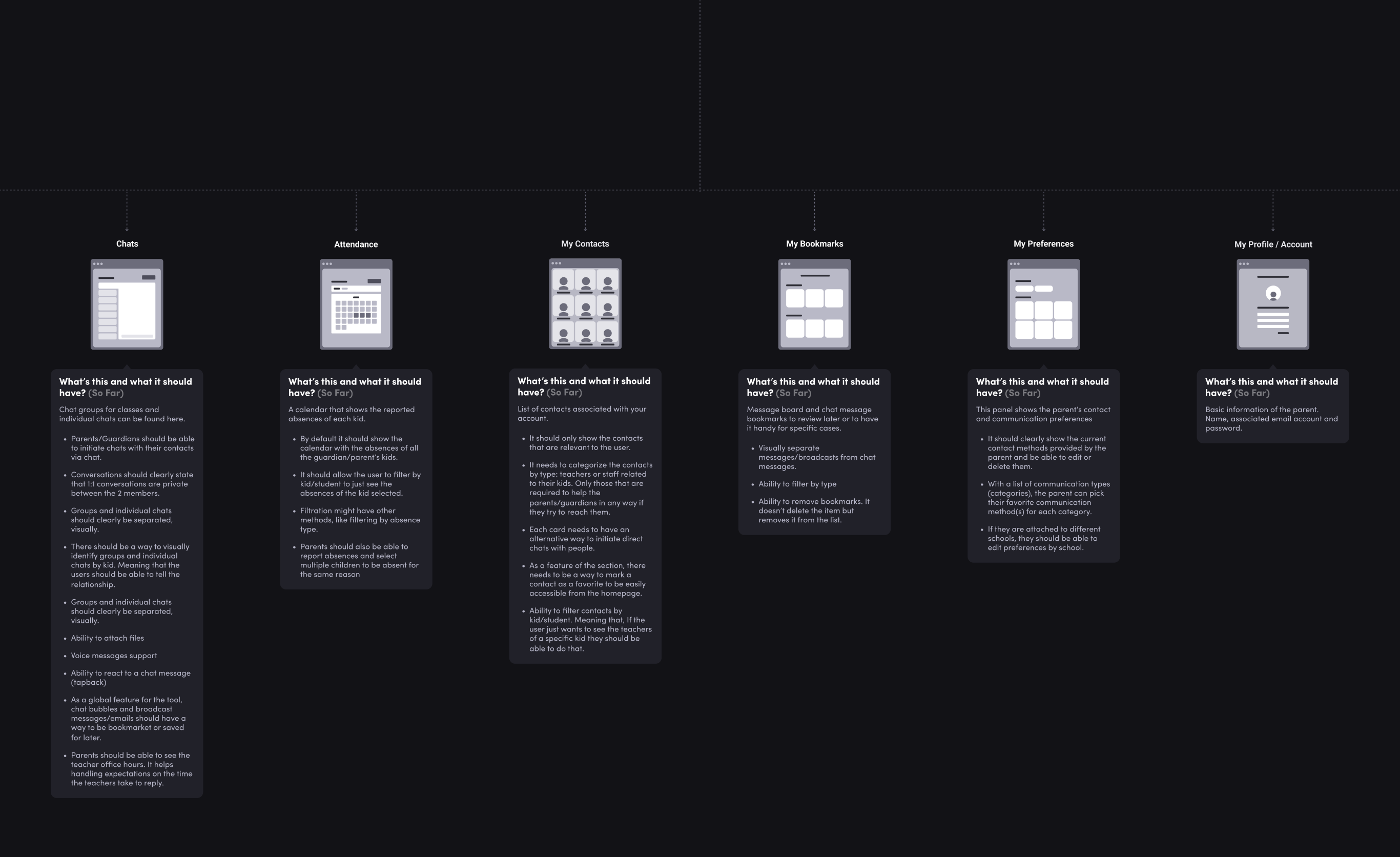
Preferences: Since parents (and occasionally teachers) were managing student information for multiple schools, tabs, and toggles needed to be clear and intuitive. With the original iteration, every tab was highlighted in blue, making it difficult to discern which actions needed attention.
-
Groups: Parents couldn’t start a message thread with teachers, leading to one-sided communication efforts throughout the school year. Contact lists were also not separated between schools, meaning users had to filter through an expansive list to find the person they wanted to message.
-
Contacts: The contacts list was missing the navigation menu entirely. The content was also misaligned throughout the screen, making reading a disorienting experience.
Redesigning The User Experience
Through our research process, we gained a clear understanding of the user’s goals and found where they intersected with Intrado’s business strategy. The main objective was to redesign the app with a contemporary look and feel, but it quickly became apparent that SchoolMessenger’s issues ran much deeper than outdated visuals.
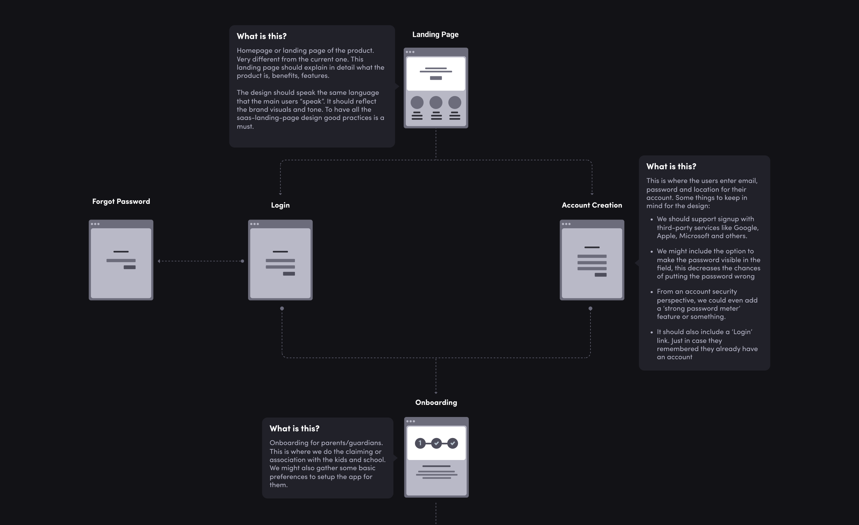
Before tackling this mammoth redesign project, we had to restructure the entire sitemap and user flows to operate more logically from screen to screen. We began with the onboarding process, rearranging the sign-up flow so parents could enter their information in a few clicks and claim their students’ information from the school’s database.
Next, We took the information gathered during onboarding and consolidated everything into a sleek dashboard with clearly segmented sections, calling special attention to chat features and new message notifications.
To streamline the chat experience, we relied on user interviews to incorporate design elements that assist with identification and communication. This included adding avatars, filters, photo/document attachments, “seen” features, and an option to mark messages as read/unread and delete them as needed.
The other important factor to consider with messaging was translations. Since most teachers spoke English and many parents spoke Spanish or French as their native language, we wanted to ensure that translations between senders were seamless and accurate.
With the Google Translate plug-in, messages were automatically translated to the user’s preferred language for group chats, one-on-one messages, and broadcasts. By implementing this simple plug-in, we added another layer of accessibility to the product that it didn’t have before.
Once we had the navigation and messaging flows nailed down for all of SchoolMessenger’s chat features, we began modernizing the visuals within the app.
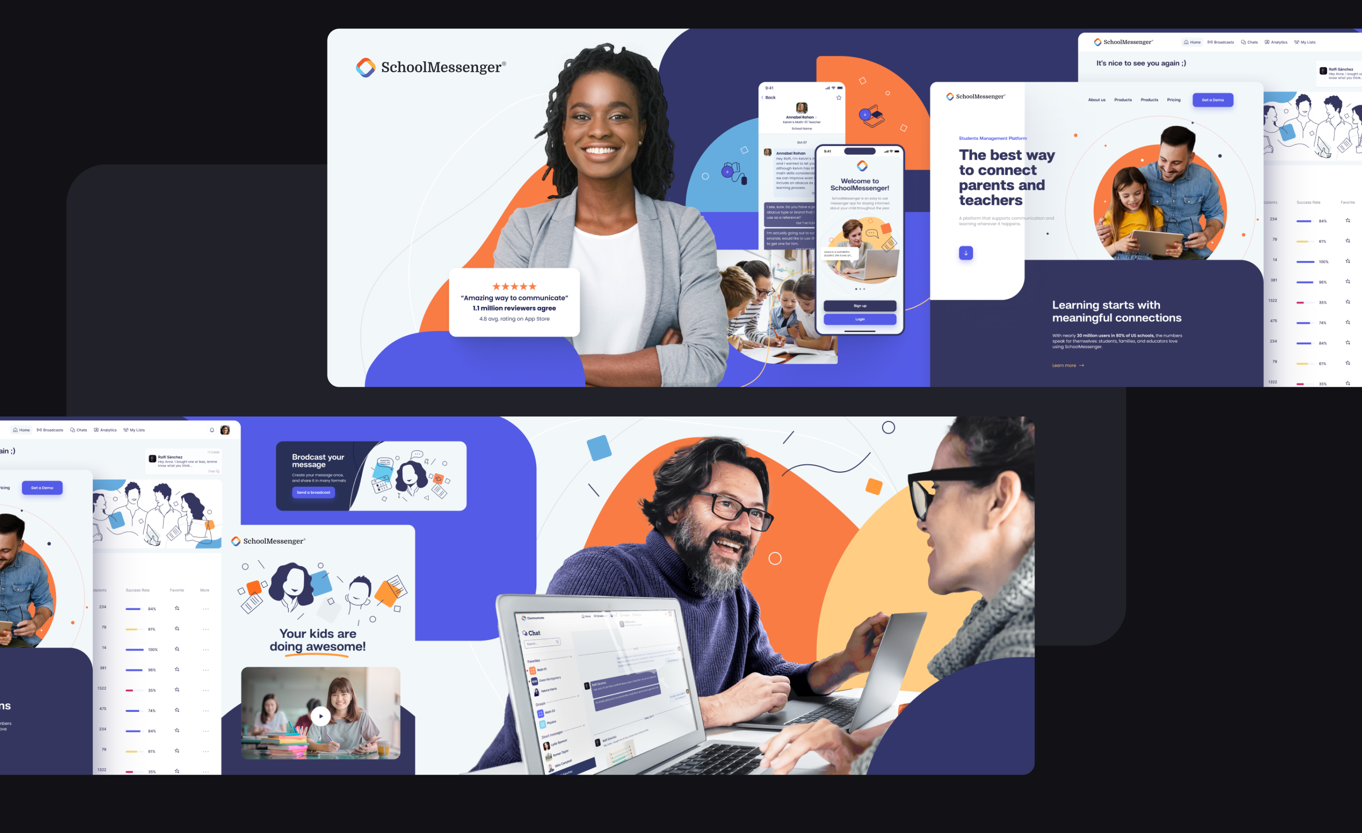
We brainstormed with SchoolMessenger’s internal team, developing mood boards to flesh out the aesthetics and visual presentation. Once we agreed upon the new look and feel, we produced stylescapes to ensure consistency between screens and implemented everything into a prototype.
Validating Our Work
Before we could begin our development phase, we wanted to double-check our work to ensure our revamps weren’t just for show.
We conducted non-moderated testing on a third-party platform, Usability Hub, and recruited participants who were parents or guardians with one or more children. The goal was to test the product concept, evaluate the ease of usage, and identify bugs with the product in the prototype phase.
Key Usability Metrics:
-
64% of users took less than a minute to create and send a message.
-
70% of users could filter through their inboxes and read a new message.
-
84% of users could discover hover menus to mark a message as “read”, delete it, or bookmark it.
-
80% of users easily found teacher contacts and favorited their profile.
-
75% of users could navigate their settings and change their password information.
-
96% of users could understand two-way chats and adjust their notification settings
While our new SchoolMessenger variation was performing well, our user feedback showed us where to make tweaks to optimize the product.
With simple terminology edits, quick action buttons, copy truncation, layout shifts, and hover elements, we removed several barriers before implementing code — ensuring an MVP that was free of bugs and usability issues before launch.
The Result
Our redesign for SchoolMessenger gave them a new, polished interface where users could easily start and send messages with their contacts, giving them answers to all their questions throughout the school year.
Satisfying the user's goals was only one half of the equation. How did Intrado benefit from our UX overhaul?
Thousands of school districts in the US and Canada relied on SchoolMessenger to connect parents and teachers for the last 20 years. However, the SaaS market is extremely competitive — and as more streamlined products emerged, Intrado was at risk of losing their core customer base.
Before our redesign, Intrado and one of the largest school systems in the country had a long-standing partnership through the SchoolMessenger app. But the outdated interface and convoluted navigation caused significant communication barriers, leading to high task abandonment and low adoption rates.
As audiences get used to more intuitive SaaS products, they become less willing to return to old processes. Think of it this way, could you imagine using a 20-year-old website to shop for clothing when there are millions of fresh e-commerce products with innovative buying features?
The district acknowledged that SchoolMessenger’s archaic design and code were no longer conducive to their day-to-day operations. If Intrado didn’t make serious changes, their 15+ year relationship was going to end.
Thankfully, our strategic UX/UI revamp was enough to impress major stakeholders in their first meeting — and they enthusiastically renewed their contract with Intrado. With this partnership repaired, Intrado’s future in SaaS looks bright with the CreateApe team at the helm of their UX efforts.
What Can We Learn From The SchoolMessenger Redesign?
There’s a world of opportunity in SaaS as technology evolves. But without a strong understanding of target users, their needs, and their behaviors, even popular products can get snuffed out.
We saw the importance of UX strategy in full force with the Intrado project, as SchoolMessenger was an inventive idea promising great benefits to its diverse personas. However, the dated design and frustrating navigation were causing the product to fall short of the user’s expectations.
Without a UX strategy in SaaS, you’re investing a ton of time and money into a product that doesn’t serve a purpose in your target market. This leads to low task completion rates, high abandonment rates, and leaving a sour taste in your users' mouths.
Even if your product functioned fine 20 years ago (like SchoolMessenger), it’s important to have a long-term strategy to adapt to shifting user behaviors, incorporate new technologies, and stay competitive.
Best Practices For SaaS UX
-
A User-Centered Approach Is Non-Negotiable: The success of a SaaS product lies within its usability and the value it provides to the target audience. The SchoolMessenger project highlights the importance of user-centric design, as the flows and features had to operate logically for people with varying tech capabilities.
-
User Satisfaction Leads To Revenue Generation: The subscription-based model means that users can just cancel if they’re unsatisfied with the product, tanking your revenue. The only way to combat this and maintain existing customers is by designing for their wants and needs.
-
Efficient Workflows Drive Success: By designing for the target users’ thought processes, we streamlined task flows and made the end-to-end experience accessible and intuitive. Through testing, we identified and rectified pain points before launch — ensuring we could quickly meet the needs of our users and guarantee satisfaction.
-
Simplify The Learning Curve: Learning a new system can be intimidating for new users, but a well-designed onboarding process can make them feel more at home while navigating the product. It also significantly reduces task completion time and help requests.
-
Scalability Is Essential: Adapting to evolving user needs is paramount. The SchoolMessenger redesign ensures that the platform is both modernized and able to accommodate new profiles and use cases, securing its relevance in the ever-changing SaaS landscape.
-
Data-Driven Design Instills Confidence: Our reliance on testing, user feedback, and data-driven insights to improve the user experience underscores the importance of making informed decisions. This approach ensures that design updates are aesthetically pleasing and positively impact the flows and navigation.
The SchoolMessenger redesign reminds us of the power of user perception in business. By shaping your UX strategy around their behaviors and feedback, you can create a product that provides long-term value to a diverse audience as well as your business — opening the door for further innovation opportunities in the flourishing SaaS market.
Is strategic UX/UI design essential for SaaS success?
Alessandro Fard is a 22-year digital product veteran and fractional CPO. He has worked with well-known brands like Facebook, TrueCar, and Lynda.com and has consulted hundreds of businesses ranging from startups to Fortune 500 companies.
His work has been featured in major publications like VentureBeat and TechCrunch50. He is a published author in UX Magazine and was a keynote speaker at UC San Diego and the LA Marketing Expo.
In addition to his fractional CPO and UX consulting career, he is the founder and CEO of CreateApe, a UX/UI design firm based in Irvine, CA.
Discover more TechBehemoths Insights
Learn practical tips and insights about IT Companies, how to find the right company for your projects.
Read the latest news about Market Trends and fresh Interviews.