Bad UX Design Examples and How to Fix Them


Believe it or not these days, even in the era of giving the highest priority to user experience-bad UX exists. You can discover plenty of mistakes that exist in day-to-day SaaS products. You can find many UI and UX design challenges; there are different vital ways to deal with them.
This blog will list some standard bad UX designs templates-from poor sign-up flows to missing app actions.
Before going in-depth, first, let us explore what bad UX is.
What is UX Design?
User experience, or UX, is the process carried out by design teams to use or create products that offer a relevant experience to users. UX design involves fundamental aspects, from branding to usability and function.
What is Meant by a Bad UX Design?
Any form of design that does not offer help to users accomplish their tasks when they are trying to form a connection is an example of bad UX. Bad UX can cause stress to users as an outcome of multiple errors. Compared to good UX design, bad UX results from random inadequate decisions based on a product or a design decision.
What Counts as a Bad Experience for Users?
The prime cause behind a website or an app providing a bad experience is that it doesn't meet the target audience's expectations. Moving from the basic UX design rules such as accessibility, simplicity, and aesthetics can leave a poor impression on the users.
#1 Hamburger Menu
What is a hamburger menu?
A hamburger menu icon is a common feature that uses three lines-which appear like a burger between two buns- to represent a menu of items.
The hamburger menu is quite useful for smartphone users and people who work on narrow-screen devices. However, the same menu option can seem imperfect if added to a website version- because the leading website already comes integrated with a linear menu-where navigation option are displayed.
If a linear menu is removed from a website's functionality and instead a hamburger menu is added-then it can affect usability. For front-end users, it can be an annoying inconvenience- as they'll have to first open the menu and then browse the website.
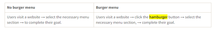
Here is an example of user flow;
Solution?
Use the hamburger menu feature only for the mobile version of your business website (or any other site). Stick to the linear menu for central performance only.
#2 WhatsApp's Delete Message Feature
WhatsApp is popular; it quickly rose to fame thanks to its great interactive UX design and super-clean interface. But unfortunately, even the most adored apps are not immune to poor UX choices.
We can all relate to one of the most common scenarios-when a person is drafting a message to deliver to another person, and by mistake, you send it to someone else, the only response one might think of is to delete the message.
With WhatsApp - the “delete for everyone” feature, you can delete the sent message and pretend it was not delivered.
But with WhatsApp, unfortunately, the following happens;

From a UX design perspective- this is horrible as it can be highly confusing for users.
If you see the option “delete message for everyone,” you might expect your message to vanish entirely for both parties.
You dearly do not expect that a residual part of your sent message remains, showing the receiver that you wrote something and purposefully deleted the message.
Solution?
Do not add features that might cause confusion for later users.
#3 Netflix hover auto-play
The Netflix Autoplay feature has bugged many users since it was rolled out in 2015.
What is Hover Autoplay?
Even a split-second hover over any TV show, or movie thumbnail instigates the autoplay of a looped montage or a trailer-which is pretty annoying.
If any user wants to see the details of any web series or film, they have to click on or hover over; they have to listen to a loud trailer playing-there is no shortcut. The interface, created to get users' attention with an easy and simply appealing thumbnail, has caused the opposite reaction.

Why it’s bad UX: Auto-anything means the designers have made assumptions about the users’ desires.
Solution?
If a feature hinders a site's usability, it should not exist in the first place. When designing an interface, ensure that you are not building elements that distract a user from crucial information.
How To Avoid Bad UX Design
Being a UX designer, you will work on different designs. You will come across various examples of poorly designed websites, etc. However, it is significant to consider these designs a learning experience and not repeat the same mistake and stick to your primary goal. When you come across a design not crafted per basic design standards, the smartest thing would be not to repeat the same mistake.
Sticking to the below basic principles will help you avoid websites with disorganized UX. To avoid creating bad UX, follow the following principles:
-
Understand the need of your target audiences. Always remember your design's primary goal, which is to help users and make “their” lives easier.
-
Map out the user journey and highlight touchpoints in your design journey. Creating a user map journey will help you keep the context in mind throughout the design creation process.
-
Give maximum control to users and let them know they have “required” management. Avoid restricting users to a set of options.
To Conclude
It is impressive that some of the worst UX designs have been around for so long-people have accepted those bad UX. A designer's role is to improve these designs and make them more user-friendly and mobile-friendly. Remember that a good UX design's value can never be underestimated.
A good UX design helps users enjoy your site or app and form a loyal consumer base. As a UX designer, you must look for inspiration from other designers-this will enhance your knowledge and assist you in creating a better and more useful design in the future. You can go for UX design services to avoid bad UX design.
Can a single bad UX design element ruin the entire user experience for a website or app?
Prabhjot Singh Creative Content Executive at UIUXDen Mississauga, Ontario, Canada He enjoys writing about current design trends and new technologies. His ability to blend words to convey the most information in the fewest possible words enables him to pro
Discover more TechBehemoths Insights
Learn practical tips and insights about IT Companies, how to find the right company for your projects.
Read the latest news about Market Trends and fresh Interviews.