The Best A/B Testing Strategies For Website Optimization

So, your website is launched and performing well…but you still think it could be better. That’s where optimization comes in.
Optimization is just tweaking your website or app post-launch to improve the user experience little by little — which, in tandem, boosts your performance metrics as the product finds its footing.
The trick with optimization isn’t “why” to test. Instead, it’s about “what” you should test and “how” to test it. And, like with most things, a simple “this or that” comparison makes the answer that much clearer.
What Is A/B Testing?

Think of A/B testing as a “Would You Rather” game. Chocolate vs vanilla, Star Wars vs Lord of the Rings, Halloween vs Christmas…whoever’s answering the question, they usually have some kind of rationale as to why they like one over the other.
UX design is all about this kind of user psychology. Apply that same logic to a webpage, and we can hone in on the design elements our target audience responds to, leading to data-informed decisions that are proven to engage users.
Why Bother With A/B Testing?
There’s no one-size-fits-all solution for digital product design. What works perfectly for one demographic could fall completely flat for another.
Think of it this way, imagine using Harley Davidson’s branding for a line of family-friendly minivans (spoiler: it wouldn’t work well).
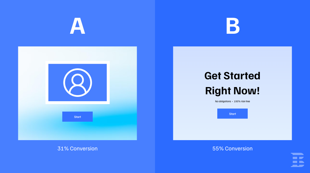
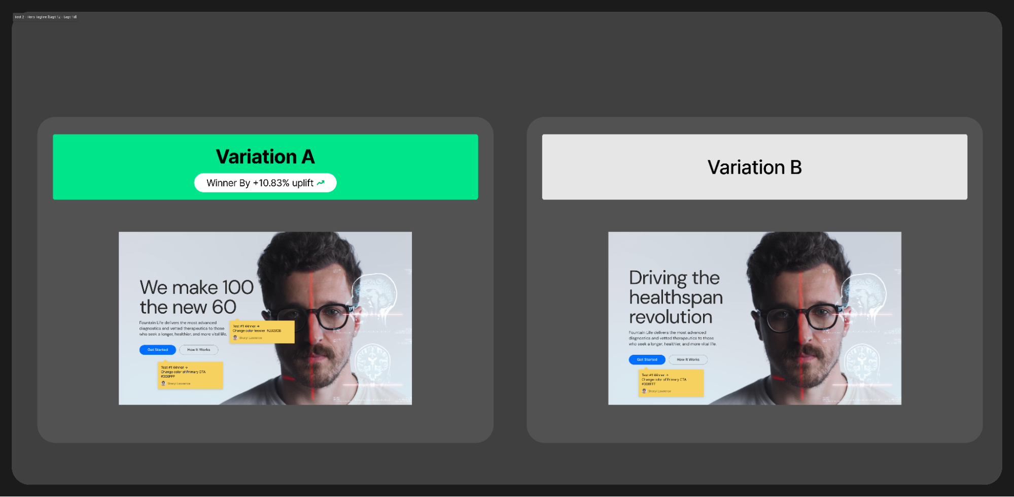
With A/B testing, your audience tells you the best approach for them by showing them two different webpage versions (A and B, hence the name). Whichever has the most interactions indicates the most effective content for your website.
The benefits of A/B testing expand beyond tailoring the experience to the user’s preferences. Let’s take a look at how A/B tests streamline the design process:
-
Performance Boost: Like giving your website an energy drink without the jitters and crash. A/B testing gives you a clear path to increasing conversion rates, user engagements, and hitting those sweet, sweet KPIs.
-
Reduced Risk: Iterating based on validated user data means you’re less likely to introduce elements that might tank your performance.
-
Better UX: What good is a product that users don’t return to? By understanding your audience’s preferences, you can help them solve their pressing problems in a more meaningful way. (Head to CreateApe.com for some top-notch insights into user psychology.)
When Should I A/B Test?
Timing is everything in business, especially when technology’s at play. Testing should be a part of your holistic product strategy to stay competitive. However, there are some instances where it’s especially important to test in order to put out the most viable product possible.
-
Before Launch: Whether you’re releasing a new product or a redesign, conducting some A/B tests is generally good practice. By showing different versions of the finished product to a small portion of your audience, you can iron out any design kinks and gauge how they’ll perform before making it widely available.
-
Activity Stagnation: Noticing your conversion metrics taking a dip? It might be time to experiment and test! Come up with a different variation and take notes about factors contributing to the decline.
-
Strategic Events: Promotions are a great way to generate traffic for your product, so try creating new content and running some tests around industry events, holidays, or marketing campaigns. Optimize elements related to the occasion and maximize your impact.
-
New User Insights: Ongoing research keeps your product relevant in your audience’s eyes. If you stumble upon any new findings about their preferences or behaviors, run some tests to adapt your product on the fly.
-
New Features Or Functionalities: A new feature can boost your experience or totally tank your product. Before going live, test it to see how your audience responds and ensure it doesn’t negatively impact your product’s usability.
The Pros & Cons Of A/B Testing
Though I make A/B testing seem like a magical UX shortcut, data collection isn’t all sunshine and rainbows. It can be a time-consuming process that sucks up resources and delays product launches.
The details can quickly fall through the cracks — especially when numbers are involved. Before you initiate your A/B testing efforts, it’s crucial to understand the potential drawbacks to ensure you’re not wasting valuable time on superficial changes.
Pros:
-
Iteration & Refinement: Optimization is about making small tweaks over time to enhance the experience. A/B testing lends itself perfectly to the iterative nature of UX design, making improvements in small increments based on user feedback.
-
Enhanced Visual Appeal: So many colors, fonts, and styles; so little time. A/B testing is the perfect opportunity to play around with visuals and pinpoint the aesthetics that get the best responses from the target audience.
-
Streamlined Conversion Paths: If there’s a particular design element slowing down conversion, A/B testing allows designers to uncover friction points and fine-tune the product — making conversion funnels faster and more intuitive.
Cons:
-
Short-Term Focus: A/B Testing is mostly for short-term metrics. While the data you gather gives you small insights into your user’s behavior, it won’t show you their entire thought process when interacting with the product.
-
Interpretation Matters: This process requires a solid understanding of statistics for correct interpretation and implementation. If you’re not math-inclined, don’t be afraid to ask a data analyst for help!
-
Scope Limitations: If the product has deeper flaws than CTA copy or content positioning, A/B testing might not clue you into them. This process only measures the specific elements being tested, not the holistic design issues impacting the experience.
Your Ultimate Technical & Strategic A/B Testing Game Plan
It all comes down to strategy — finding the best approach to satisfy both internal stakeholders and end-users.
Unfortunately, it’s not as simple as holding up two product versions and asking “This or that?” A/B testing requires a technical and methodical approach to accurately determine which variation serves the users and business goals better.
Data collection is your guiding light in any design project, so follow this play-by-play to leverage it to your advantage:
-
Set Clear Objectives: What’s your endgame? Do you want more sign-ups, higher engagement, more purchases, or less abandonment? Define your goal and set up KPIs you can actually measure with your A/B testing data.
-
Select Your Testing Variables: Perform your tests one variable at a time to avoid muddling up your data (headline length, CTA button, image, logo color, etc.)
-
Split Your Audience: Divide your audience into two random, but equally sized groups to keep your data balanced.
-
Implement The Code: If you’re using an A/B testing tool, the system will generate code snippets for each variation with JavaScript or HTML code. Add the base code in your website’s HTML, then add the corresponding code snippet where you want the variation to appear. Repeat that step for each variation you’re testing and ensure it’s in the correct location.
-
Test & Verify: Since you may be testing different pages and audience segments with your variations, double-check your work in the staging environment and configure the tool to target the correct pages. You’ll also want to guarantee your tests don’t disrupt your product’s usability.
-
Monitor Testing Activity: After testing your tests (say that 10 times really fast), launch and monitor the progress. Observe the data over the test period to ensure there’s enough activity to give you accurate measurements.
-
Analyze Your Metrics: After the test, see which version performed better and why. Hypothesize and take notes to validate your design decisions moving forward. Your A/B testing tool may also have analytics features to help you translate numbers and strategize with your team!
-
Launch & Celebrate: Whichever version wins, you just gained valuable insights into what makes your user tick. Roll with that version and pop that bubbly!
My Favorite A/B Testing Tools
Not sure where to start with your A/B testing journey? I know…it seems intimidating when you look at all the to-dos.
The good news is that we live in the digital age! The online services and AI-powered tools are endless. I use these tools to ditch the spreadsheets and automate my data analysis:
-
Optimizely: My go-to for web and mobile optimization. Think of it as the Swiss Army Knife of A/B testing.
-
VWO: This platform comes with a handy visual editor and split URL testing. It’s like having a digital magnifying glass for every corner of your website.
-
Google Optimize: Obviously, Google has its hands in the A/B testing game. This one integrates flawlessly with Google Analytics to pull larger insights from your audience’s behaviors.
A landing page optimization agency can save the day. They’ll fine-tune your pages, nail the testing, and boost conversions—leaving you free to tackle the big stuff while they handle the grunt work.
Tales From The Trenches
I wouldn’t be giving you advice about A/B testing if I hadn’t done my fair share. Some of my biggest eye-openers as a designer came from my CRO (conversion rate optimization) projects. These are the A/B tests that forever changed my perspective of content presentation and user behaviors:
-
CTA Showdown: Once upon a project at CreateApe, we tested a “Sign Up Now” button against a “Start Your Journey” button. The result? The latter increased sign-ups by 15%! Emotion trumps directness, especially when persuading the user to join your digital community.
-
Image Impact: On another site, we A/B tested a stock photo against an authentic team image. Let’s face it, not everyone’s a generically attractive stock photo model and users can tell who’s real and who’s not. It’s no surprise that the real team photo increased conversions by 10% and boosted our reliability.
Learn To Love Your Data Through A/B Testing
A/B testing isn’t just for number nerds who relish in data and spreadsheets (although I’m calling myself out a little bit with that statement). It’s for anyone with a website and a dream — and the willingness to make that dream accessible to others!
Whether your digital dream is more sales, sign-ups, or just a super-slick user experience, A/B tests show you everything you need to know about user preferences and behaviors. When in doubt, test it out!
And if you’re ever stuck or in need of some expert insights (or perhaps some more of my impeccable wit), don’t hesitate to knock on the virtual door of my CreateApe team. They’ve got your UX back!