3 Case Studies of Successful Mobile Apps You Can Learn From

In a relatively short time, smartphones have grown from convenient communication tools to indispensable life companions. Today, there are an eye-watering 6.3 billion smartphone users worldwide, and crucially, 88% of mobile time is spent within apps.
However, while app usage is high, not all apps are created equal. While you may have 100s of apps on your phone, the average smartphone owner uses 10 apps per day and 30 apps per month. And for the many mobile app success stories out there, there are even more failures.
In other words, some apps are just better than others, but why? Why did certain apps soar while others plummeted? The answers lie not just in code, but in strategy, innovation, and a keen understanding of user needs. And by delving deep into successful mobile app case studies we can pinpoint what works.
With this in mind, let's dive into some of the most compelling mobile app success stories to uncover the strategies and decisions that led them to stand out in a saturated market.
Successful Mobile App Case Studies
We’ve looked at several factors when choosing the apps on this list, namely, innovation, market position, and revenue, among others.
Let’s get into it.
Duolingo

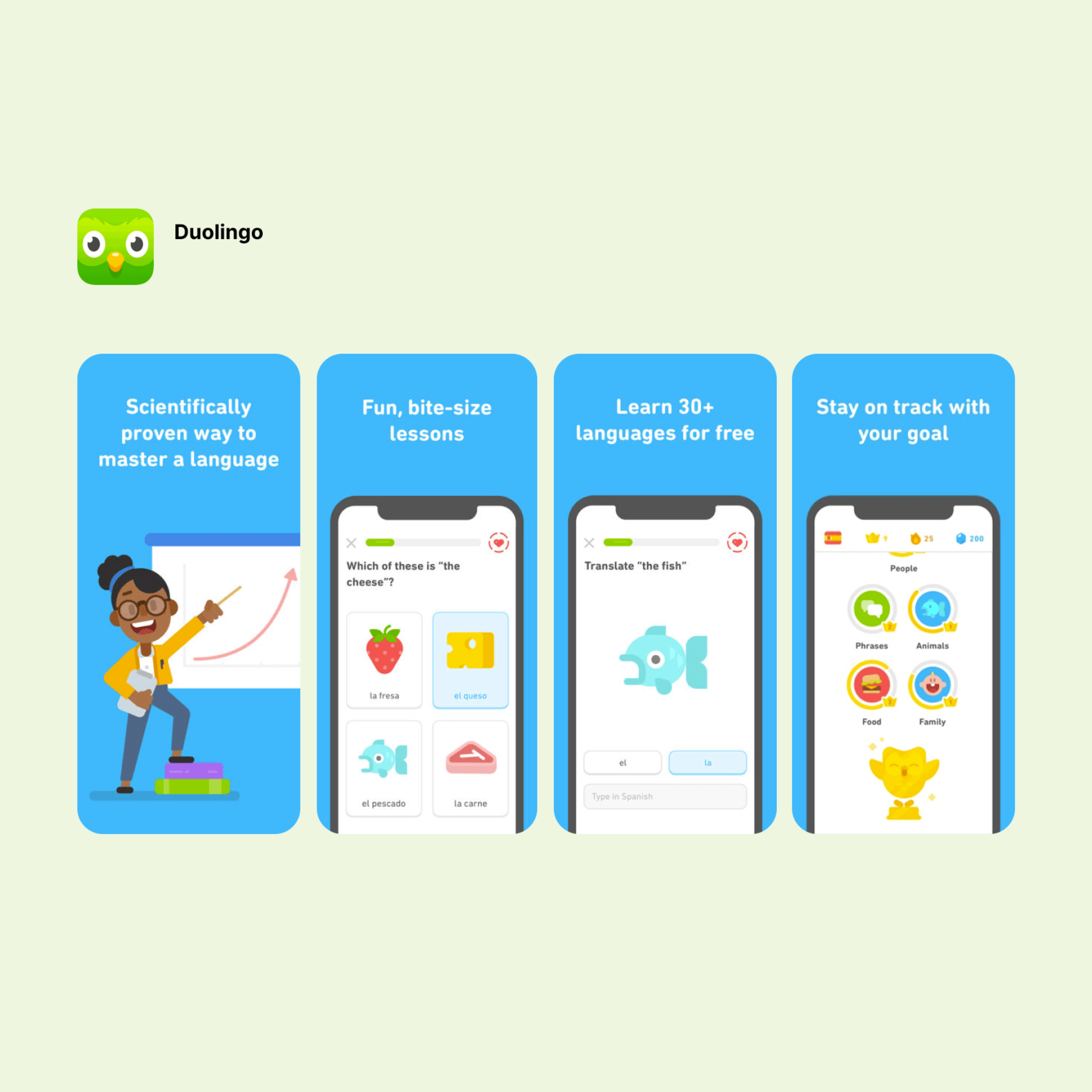
When Duolingo launched as a private beta in 2011, it had only 6 languages (compared to 43 today), but was an instant success. By the time it launched to the public in 2012, it had over 300,000 people on the waiting list. Fast forward to today: with a revenue of $369.7 million in 2022, a 47.3% year-on-year jump, and a user base of over 500 million (37 million active monthly), Duolingo's monumental growth is a testament to its enduring appeal and effectiveness.
To understand why Duolingo was such a hit, we first have to understand the landscape of language learning back in 2011. Back then, learning languages was a time-intensive and costly endeavor, with the main product, Rosetta Stone, sporting a hefty price tag. Duolingo CEO Luis von Ahn, in a 2014 conversation with The Guardian, highlighted this: “There are 1.2 billion people learning a foreign language and two-thirds of them are learning English to get a better job... The problem is they don’t have equity and most language courses cost a lot of money.”
So aspiring language learners had a problem (learning a language was too expensive), and Duolingo provided the answer - a free and accessible app.
Now, let's dive into Duolingo’s mobile app development insights and see what made it a resounding success:
-
Gamification and feedback loops: Duolingo's success lies in its ability to merge gamified elements with feedback mechanisms effectively. The streaks feature, for instance, doesn't just incentivize daily practice—it provides real-time feedback on consistency, pushing users to maintain their learning momentum. Similarly, leaderboards give learners a comparative view of their progress against peers, making it clear where they stand and where they need to improve.
-
Personalized learning (user experience): Duolingo tailors its lessons to the individual user's needs and progress. This helps users to learn at their own pace and master the material.
-
Wide range of languages: Duolingo offers courses in 43 languages, which gives users a lot of flexibility when choosing what to learn. Expanding the language offerings allowed Duolingo to grow and scale, attracting new users.
-
Active community: Duolingo has a large and active community of users who support each other and learn from each other. This helps to create a positive and encouraging learning environment.
-
Brand Identity with the Owl Mascot: Duolingo's owl, while playful in design, plays a crucial role in the app's brand recall. Beyond being just a mascot, its persistent reminders have been both a point of user engagement and internet humor.
MyFitnessPal

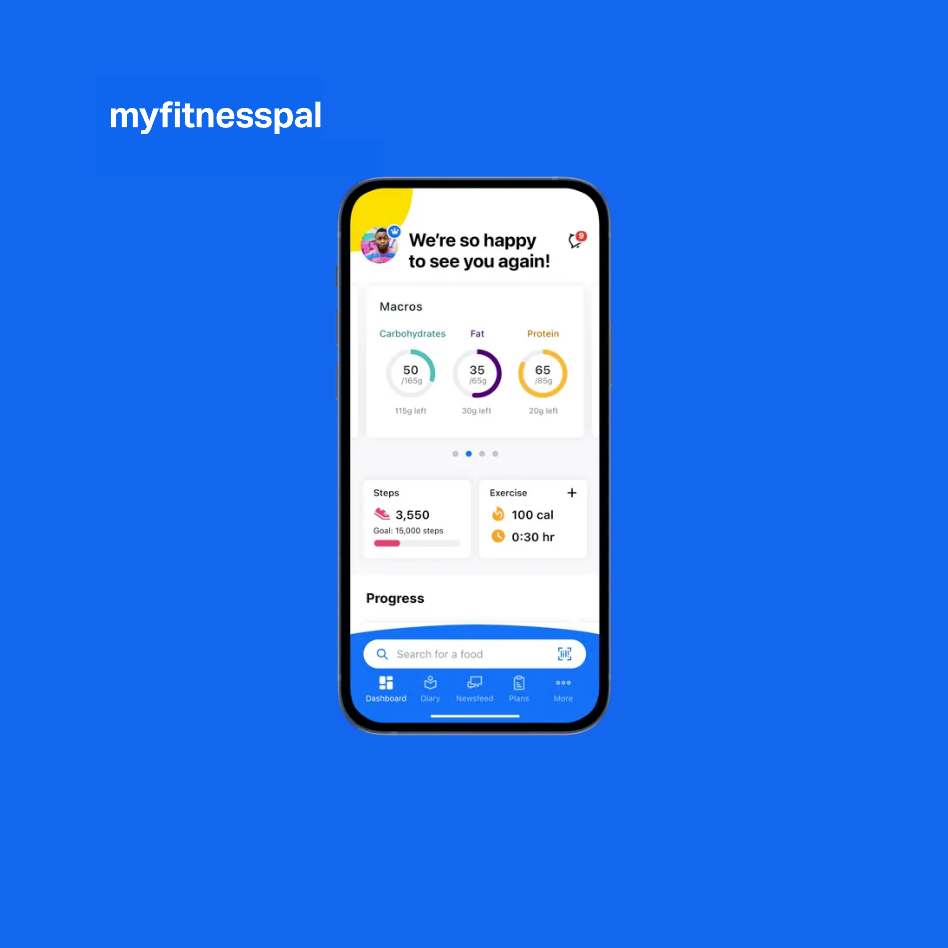
When MyFitnessPal entered the market in 2005, it offered a digital solution to a problem many faced: accurately tracking calorie intake without relying on pen and paper. By shifting this task to a digital platform, the app streamlined the process for millions. And we mean millions - as of 2021, MyFitnessPal had over 200 million registered users and generated an eye-watering $247 million in revenue.
A deeper dive into its success reveals:
-
User Experience: MyFitnessPal's utility is anchored in convenience. By allowing users to select pre-made meals and workouts from its extensive databases, or even add custom meals and workouts, the app provides both flexibility and precision for health tracking.
-
Feedback Loops: One of the app's strengths is its feedback mechanisms. Users can set specific goals, from weight long-term loss targets to daily nutritional objectives. The app then provides progress graphs and statistics, offering clear insights into a user's journey.
-
Integrations: On a technical level, MyFitnessPal has effectively integrated with popular platforms like Apple Health, Google Fit, and Fitbit. This interoperability reduces the need for manual data input across multiple platforms.
-
Legal and Ethical Considerations: Health and fitness apps come with inherent risks, especially for users who might tend toward unhealthy eating habits like compulsive under-eating. MyFitnessPal has incorporated mechanisms to caution users about potentially harmful behavior. For example, if you select a daily calorie goal that's dangerously low, the app will warn you about the dangers.
-
Premium features: Users can pay for extra features like tracking macronutrients by gram, food analysis, custom goals for different days, and an ad-free experience. But crucially, the free version of the app still packs a ton of features.
Slack

Slack is one of the biggest mobile app success stories in tech. Following its public launch in February 2014, it achieved an astounding 500,000 daily active users in less than a year. Fast forward to today, and a whopping 43% of Fortune 100 companies use Slack. But what makes Slack tick?
-
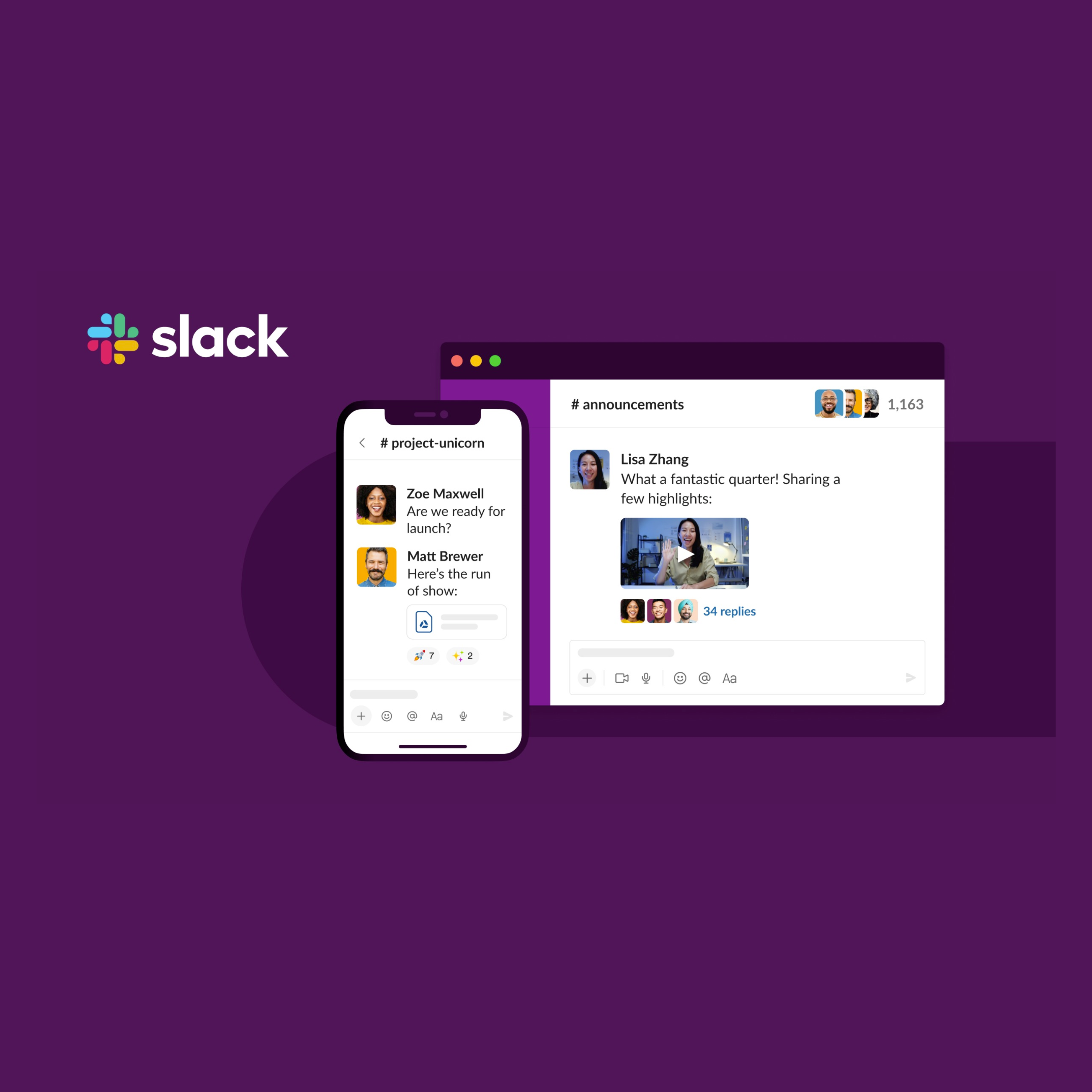
Design Difference: Slack went a different route than many enterprise tools that were often considered lifeless and dull. Its brighter, video game-inspired color palette set it apart from competitors.
-
Transparency and Centralization: Slack's real change was in how teams saw and shared work. Before Slack, viewing another team's progress meant physically approaching them or going endlessly back and forth on email. Slack provided a unified platform, blending chat, file-sharing, and emails, reducing the need to switch between tools.
-
Marketing Choices: Slack made some creative marketing choices like their product video titled 'Animals' and their podcast, "The Variety Pack". The podcast alone gained over 3 million listens in its first year.
-
Integration Options: Slack's appeal also lies in its adaptability. With over 2,600 apps in the Slack App Directory, its users have an almost limitless ability to customize their feed.
-
User Experience and Pricing: Slack's user setup is simple: a few clicks and you're in. While it offers many features right away, its free version does have limits—like a cap on searchable messages and integrations. However, these only come into play once users have fully integrated Slack into their routine, making the transition to paid versions logical.
Wrapping Up - Lessons from Top Mobile Apps
Want to make your app stand out? Look at the giants that came before. Duolingo made learning fun by turning it into a game. Slack ditched the boring software look and went for something more lively. The lesson? Solve a real problem but do it differently than everyone else.
Start by offering robust functionality without hefty price tags. Draw users in with comprehensive free features, then present quality paid options that elevate their experience. But don't stop there. Keep them hooked by integrating feedback loops that entice them to interact daily, fostering both commitment and growth. By blending user-centric solutions with unique approaches, you position your app not just as a tool, but as an indispensable part of users' routines.
And always, always listen to your users. They'll tell you what they love, hate, and what they're willing to pay for. In short, give people what they need, make it fun, and they'll come back for more.